Thursday, November 17, 2016

The Sketches of Antoine Predock // Adair Jones

A portion of Architect Antoine Predock's sketches have been collected by Christopher Curtis Mead in Drawing Into Architecture. These include some of his own architectural designs, but mostly the landscapes and structures he has encountered in his world travel.  He strives to translate the physical world with strokes and lines that capture the spirit of the subject. As stated in the introduction of the book, "drawings are instruments of understanding and intuition."

The following are some of his sketches along with my own comments.

 Leifeng Pagoda West Lake, Hangzhou, Zhejiang Province, China, 2007 

 Luxe Lake New Town Gateway, Chengdu, China, 2010 

  
 Luxe Lake New Town Gateway, Chengdu, China, 2008 

The three sketches above are all representations of China, but are drastically different in style and feel. In the first, there is an emphasis on the landscape, and the structures nestled within. The next is from an unnaturally high perspective, looking down on the structure and landscape as if in an attempt to capture the entirety of the scene in one sketch. The next sketch is much more detailed and technical, though the individual lines and elements are loosely drawn. 
.
.
 Lizard Island, Great Barrier Reef, Australia, 2002 
 
 Mid-Atlantic from the Torm Agnete Freighter, 1962 
  
 Oman, Arabian Peninsula, 2009    +    Oman, Arabian Peninsula, 2008 

Here are some examples of how he captures a landscape in a minimal way, having just enough line or depth to reveal the scene. The lack of information leaves room for viewers to fill in the space with their own feelings and thoughts toward the scene and landscape.
.
.
 
 San Gimignano, Tuscany, Italy, 2000 

Here, minimal use of line is seen again. The varying depth of the strokes simplifies the landscape. It functions as a visual note or abbreviation of a landscape that we can then recall in more detail from the depths of our own imagination. 
.
.
  George Pearl Hall, University of New Mexico, Albuquerque, 2007  +  Cornerstone Arts Center, Colorado College, Colorado Springs, 2006 

It is interesting to compare the different ways he chooses to tackle a structure. In shifting perspective,  he prioritizes what is to be presented to the viewer. 
.
.

 Notre Dame, Paris, France, 1983   +   Pantheon, Rome, Italy, 2008 

It is also interesting to see how at times he chooses to include detail and at other times just allows lines to give the suggestion of detail. Here, Notre Dame has much more information inserted into the piece than does the Pantheon. Yet, the Pantheon has more emotion attached to it as the lines present a sense of openness, giving more room for us to fill in with our own perception and imagination.
.
.
 Austin City Hall, Austin, Texas, 1999 

Sometimes he creates sketches with so few lies and detail it is abstract. At other times, ( as seen above ) he translates his surroundings onto the page in so much detail and complexity that the image becomes abstract.
.
.

 Student Activity and Recreational Center, Ohio State University, Columbus, 1999 

Here, he again abstracts the scene to the point we could not guess what it is. However, the location given grants us enough context that we can now see the space as he saw it-- perhaps a line of chairs to the right that extend down a narrow room.
.
.

 Duomo, Florence, Italy, 1983 

Though the last picture discussed needed the context of a location, Predock also has the capacity to draw a space with such precision that no context outside of the lines on the page is needed to know exactly what he is seeing.
.
.
Canadian Museum for Human Rights, Winnipeg, Manitoba, Canada, 2004

His duality in creation, his ability to abstract an image and to draw it with precision, can be see in this final image. There seem to be thoughtfully measured lines of roads and topography under a mass of abstracted elements of varying color and line weights. 

Tuesday, November 15, 2016

Thoughts on Drawing // Mercer

I’m really not an artist. The last and only time I had taken a drawing class before this was freshman year of high school because it was required. In high school I studied robotics; in college I’m studying biology. Both bio and robotics are very structural. There are patterns and rules associated with those two fields of study that cannot bend. Drawing, however, is fluid. It’s a flexible art. I’ve learned over this semester to appreciate that quality of art. There are no rules when it comes to drawing. There are strategies, certainly, but the rules can bend. For that reason, I think this semester was a breath of fresh air for me.
            Drawing allowed me to look at my field of biology in a new way. My assignments often focused on aspects of life sciences, and it let me see how truly beautiful biology is – how difficult it is to capture the dynamic aspect of life.  Too often it would come out looking fake, looking plastic.
            The other thing I appreciate about art is the need to put the time and energy into a drawing. You can’t just bullshit your way through for 30 minutes and expect to have a lovely piece of art in front of you. I think this is definitely a contrast to the craziness of the modern world, where a constant stream of images and information captures our attention and adjusts our focus. To sit down and spend hours on a project is quite different from frantically trying to finish an exam in 45 minutes. And, to be fair, sometimes this was really frustrating. There were several late Monday nights this semester filled with desperately trying to shade in the rest of my drawing. But Bill made it very clear at the start of the class: the more time you put in, the better your drawing will be. And that’s true for most things in life.
            It was strange for me to present my drawings to the class. This must have been the only class in which my work was put up on the wall for display. It’s also the class where I had the least amount of confidence in my work. I’m confident in my ability to write a competent essay or construct a scientific procedure. But art? I’m really not that great at art. So to have my not-so-great art put on a wall for others to see was actually sort of terrifying. But I think it also is a good experience. In life, the work you do is not going to just sit in some professor’s drawer. It has to be viewed by many if you want to make a difference. If I expect to be successful as a scientist, my work has to be peer-reviewed and published and critiqued. For this reason, I think that the exercise of going through the drawings one by one, putting a spotlight on the owner, was a truly valuable experience. It let us reflect on the faults, take pride in the strengths, and develop our drawings in ways we otherwise wouldn’t have been able to. I hope that this process has given me the confidence to seek out criticism and feedback on other aspects of my life and profession.
             

Tuesday, November 1, 2016

Julian Abele and the Firm of Horace Trumbauer
-Addison Winston

Introduction:
The line between an artist and a craftsman has always been thin but it’s implications have always been massive.  Where a great artist is thought of as a genius, a great craftsman might be described simply as skilled.  It is the same difference between an engineer and a technician.  A modern architectural firm will often have several employees trained at a nearby community college in the “industrial art” of taking the architect’s plans and putting them into CAD.  In an architectural firm before the advent of computers it was the job of draughtsmen to take an architect’s sketches and render from them blueprints and technical drawings which could be used by foremen and contractors to construct the building.

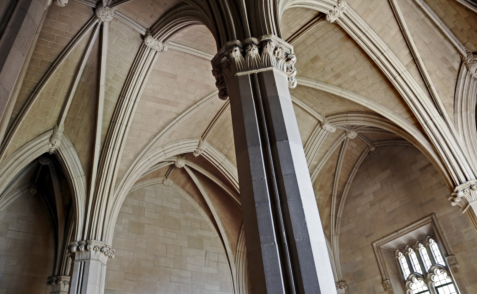
Entry Foyer of the General Library, Duke University
Rubenstein Library Entry Foyer Today


Because of the often minimal creativity required for the job of a draughtsman it is not a position frequently recorded as significant in the role of an architect’s work.  Evidence which has emerged over the past several decades suggests however that the head draughtsman of Trumbauer’s architectural firm, Julian Abele, spent much of the period between the 1890’s and 1940’s not just translating sketches into blueprints but designing many of the buildings which bear his employer’s name.  In the architectural world this is the equivalent of discovering a co-author of Shakespeare’s and giving joint attribution to each on all new editions of his work.  While this is extraordinary in many respects what is truly remarkable is that the man who designed many of the great mansions, universities, libraries, and civic monuments up and down the east coast would not have been allowed to enter the great buildings he designed because he was black.

Julian Abele (Standing) and Horace Trumbauer

A great architect in his own right, Horace Trumbauer, even at his peak, perhaps exceeded more at high society gatherings than at the draughting table.  He was a well connected businessman, a man of extraordinary taste who demanded the best of those in the firm bearing his name, and he was courageous enough to hire the first black graduate of the University of Pennsylvania’s School of Architecture, a man by the name of Julian Francis Abele.
Gothic House in Tours, sketch by Julian Abele
While his time at Penn was distinguished and well documented it was followed by a period where Abele lived briefly in France from which little documentation survives.  Alternating claims that he attended or claimed to have attended L’Ecole Des Beaux Artes in Paris appear unsubstantiated yet sketches from this time in his life survive and show the early development of Abele as an artist, architect, and draughtsman in historic European Styles.  

Widener Library, Harvard University

When Abele returned to the United States he defied the odds the world had set against him once again and began to work in the draughting department of Trumbauer’s firm, then perhaps the most prestigious in the nation and specializing in historic styles re-imagined for the modern world and the splendor of the gilded age.  Trumbauer designed “cottages” in Newport and mansions along Fifth Avenue for the tycoons of the era, but where the firm excelled was in civic monuments commissioned by the same families commissioning the marble palaces.  As Horace Trumbauer’s health declined this talented young draughtsman rose through the ranks to head the draughting department.  By the time the Widener family commissioned Trumbauer to design a new library for Harvard University the firm's best kept secret was that Trumbauer himself now signed off on buildings designed by Abele.  

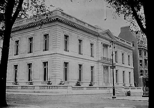
James B. Duke House, Fifth Avenue, New York

In the same way that an artist like Peter Paul Rubens is not viewed as a scoundrel for having an industrious studio it is important to remember that the same is true, often to a greater extent for many architects.  Recent recognition of Abele should not come with the degradation of Trumbauer but rather should be a celebration of a newly discovered great man’s previously unknown accomplishments.
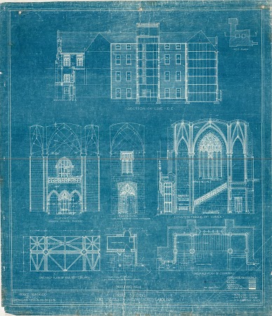
Proposal for Duke University’s West Campus, Julian Abele

Among the great mansions commissioned by Trumbauer, one along New York’s Fifth Avenue was built for an industrious North Carolinian by the name of James Buchanan Duke.  Mr. Duke was so impressed by the work that when he endowed Trinity College as Duke University he personally selected Trumbauer as the firm to handle the work.  Over the course of his life and career the only building for which Abele openly took credit was the Duke Chapel.  Due to the all white policy of the campus and violently enforced segregation in the south, Julian Francis Abele would never see it.
Duke Chapel, Julian Abele
High resolution images of sketches and work by the Trumbauer firm lead by Abele can be found on my Google Drive account at:

Sources:


Wednesday, October 12, 2016

JENNY SAVILLE's WORK - By Francesca Davie 

“Good art is not what it looks like, but what it does to us” – Roy Adzak

Adzak’s quote embodies my perspective on Jenny Saville’s raw and intentionally uncomfortable nudes. Her work challenges the very notion that art should conform to the unsaid yet prominent expectation that art should be aesthetically pleasing and act as a spectacle for viewers to enjoy. Rather, Saville’s obese painted female bodies stand in their dominant pose and towering stature indicative of female capacity for self-autonomy yet simultaneously disturb and conflict this perceived confidence by the depersonalization of the titles of her work. These multi-faceted and conflicting messages render tension - the very device that Saville capitalizes on to provoke and make viewers realize that indeed, art is not about appealing paintings or appearance but much more about “what it does to us”.

The contemporary British painter, Jenny Saville, (1970 Cambridge, UK) is notorious for her enormous and imposing female nudes.  She studied at the Glasgow School of Art (1988-1992) but it was whilst in America, on a six-month scholarship at the University of Cincinnanati, that she became fascinated by the large women in the shopping malls: "big white flesh in shorts and T-shirt. It was good to see because they had the physicality that I was interested in". It was this shameless "physicality" that influenced her later work.  After graduating from the Slade School of Fine Art (1992-1993), Charles Saatchi purchased her whole collection, bringing her powerful and provocative paintings to media attention. In 1994, Saville returned to the US, where she spent many hours observing the plastic surgeon, Dr Barry Weintraub, performing cosmetic surgery in his clinic in New York.  This increased her understanding of human anatomy and both the physical and psychological effects of operations such as liposuction.  Her intrigue pertaining to volumes of flesh became the impetus for some of her gargantuan canvases.


Branded:

Saville’s morbid paintings radically protest society’s accepted notions of beauty and female identity.  As a teenager in the 1980’s Saville recalls: “everyone was obsessed with the body – it was all about dieting, gym and the body beautiful.”  Nowadays, this attitude is even more ubiquitous. Saville delves into the topic of the “body beautiful”, with her huge canvases overflowing with obese, fleshy bodies. Saville injects self-autonomy into her paintings in the way in which she assumes role as both model and artist – an objectively empowering move: "I don't like to be the one just looking or just looked at. I want both roles". However, the choice of the painting title: “Branded”, creates a total contradiction to the personalization she had just imposed. Branded both in meaning and past tense verb form, imply depersonalization and the power of society over the body in which she has painted. It highlights a relatable tension that women feel – the desire to be independent, autonomous and free in their lives and their appearance, yet the awareness that they are subconsciously primed and branded to fit society’s perception of how they should look and behave. Furthermore, the past tense of the word “Branded” creates a sense of finality - trapped certainty - as though the compulsory societal branding is already done – helplessness since seemingly no female has the capacity to override it. Saville herself is petite, but she intentionally distorts and misrepresents her body in the paintings for maximum impact on the viewer. 

In “Branded”, (1992, 7’x6’), not only does she use an enormous scale of canvas, but she exaggerates the size of the subject by her use of upward perspective, making the stomach and breasts seem huge in comparison to the miniature head. The flesh is blotchy and her use of discolored and expressive strokes are tantamount to the appearance of butchered meat. Saville is particularly clever in her use of titles to convey her message. The obese body is “branded” with words such as: "delicate", "supportive", "decorative", "petite", ‘’irrational".  These contradictory adjectives accentuate the disparity between society's definition of female identity and the reality of the body in the painting.  As highlighted previously, the title, "Branded" denotes ownership and identity and suggests that women are stamped with society’s mark and judged accordingly. The woman here is gripping a layer of fat, almost flaunting her imperfections thus creating a new standard for empowerment.  Saville presents a body far cry from the idealized images of the females seen in the media and yet she implies that it is possible to be comfortable with this reality.  “I’m not painting disgusting big women, I’m painting women who’ve been made to think they’re big and disgusting.” Psychological, powerful and provocative, Saville questions our whole re-assumptions on society’s limited mindset in regards to how women are perceived and “branded” as well as the purpose of art.


Mother and Children

“I'm trying to see if it's possible to hold that tipping moment of perception or have several moments co-exist...Like looking at a memory.”
—Jenny Saville

·      Saville’s “Mother and Child” (3/4x7/8), charcoal drawing presents a completely different facet to Saville – one characterized by intimacy, curiosity and an embraced perspective on beauty – specifically, the beauty of motherhood and childhood. Although still large in scale, this charcoal drawing is powerful in highlighting the progressive and ever evolving bonds between mother and child. This is powerfully translated through Saville’s choice of the medium of charcoal which enables her to smudge and create overlapping drawings on top of drawing - giving the effect of movement, energy and an uncanny lifelike quality to mother and child. This draws on Saville’s own emotion following the birth of her first child (a son) in 2007 which acted as the catalyst to her expression of the power of creation. This dynamic life form inspired (artistically) by Leonardo Da Vinci’s the virgin and child with Saint Anne, goes beyond the confines of a static image by Saville’s determination to infuse the drawing with multiple layers - representative of the multifaceted and ever evolving mother – child bond. The fact that the sketch is unfinished is also ripe in symbolism – this is an unfinished drawing in the same way that the bond between mother and child is not static or finalized. Rather Saville challenges static stagnancy of all past artist’s work with their fixed lines and decides to transcend time and space by creating enduring “memory” indeed, “several moments that co-exist”. Interestingly, in both “Branded” and “Mother and Children” -  there is a common theme – the power of woman. In “Branded” the subject can be interpreted to be conflicted in her desire to be a woman but also imprinted by society’s version of a woman, whilst in “Mother and Children” the raw power of woman as a creator is emphasized with the reference to birth and children. Saville displays herself here as irrevocably changed – glorifying the power of the female body to create – a genuine appreciation for its power rather than merely a body - a branded tool for male seduction. Her varied line strength and quick superimposed lines, reflect the movement, evolution and process of having a child – subverting the expectation of a static image and making room for the realization that we share emerging and unfolding relationships between us as beings and beings that we create.