Saturday, September 30, 2017

Saul Steinberg (1914-1999) - Raisa Reed


Saul Steinberg was a Romanian-born, American cartoonist. His artwork delves into many styles, techniques, and mediums with the purpose of comic relief from the seriousness (and absurdity, as he might suggest) of typical, everyday life. Most renowned for his New Yorker cover artwork, Steinberg stretched far and wide in artistic success.

Steinberg was born on June 15, 1914 in Romania, but soon moved to Bucharest where his father owned a printing shop and manufactured boxes. After high school, he studied philosophy at the University of Bucharest before moving to Italy where he would study architecture. It is here that he first began his work as a cartoonist--doing satirical artwork for Bertoldo, an Italian magazine. However, during his time in Italy, Steinberg, being Jewish, was placed into an Italian concentration camp until his New York agent acquired a Dominican Republic visa.

Steinberg thus lived in the Dominican Republic--where he first began drawing for the New Yorker and a few other American magazines. He obtained his U.S. citizenship after being recruited into the U.S. Naval Reserve in the Office of Strategic Service. This job sent him to China, India, North Africa, Italy, and Washington, and in each place, his focus was creating political propaganda that was illustrated to appear as if there were a German Resistance. In this time, he continued to create drawings for the New Yorker of military life in these various countries.

In 1944, Steinberg married painter Hedda Sterne and built a social life full of artistic geniuses like himself.

The culmination of Steinberg's past led him to be an artist that relied purely on images on paper to relay his witty messages and commentary. He referred to himself as "a writer who draws," but many artists believed that he could also have been considered "an artist who writes," because his artworks held such clear messages without so much as a single word on the page.

View From 9th Avenue, 1976. Ink, pencil, colored pencil, and watercolor on paper.

As noted above, Steinberg was an immigrant to the United States, and he was also well-traveled in his lifetime. He spent nearly all--if not all-- of his American life living in New York City, New York, and his overall impression of America was that people took themselves much too serious. This drawing illustrates how citizens of NY viewed the rest of the world. Notice how Steinberg uses various mediums in one piece--one fact I found most intriguing about his artwork.

Untitled (Rush Hour), c. 1969. Rubber stamps in black ink, and pen and black ink, over graphite, on ivory wove paper.
Another intriguing part of Steinberg's works was that he enjoyed using rubber stamps. The drawing above an example of this method. While he has some drawings in which he used stock stamps, this drawing encompasses stamps made from Steinberg's own drawings--both the people and the cars. Again, he encompasses multiple mediums--using both stamps and pen in this drawing. It's believed that Steinberg found his stamp interest while doing military office work.

Not Yet, 1965. Watercolor with colored pencil, pen and black ink, and graphite, with black chalk and rummer stamp in black in, ruled in back chalk and graphite, on off-white wove paper.
Above it is mentioned that Steinberg didn't use words in his cartoons, and this appears to be an evident violation of that statement. However, the words "Not Yet" in the above drawing is the cartoon. Like conceptualists of the 1960's, Steinberg drew images that were focused on words--except, his words were drawn in a way that expressed their meaning--hence the unfinished nature of the words in this drawing. Notice, also, the stamp in the upper left that follows Steinberg's love of stamps, but do not neglect the fact that the stamp appears to hold words, but simply mimics language and doesn't actually say anything. This was Steinberg's style--using words as visual elements, but not for the purpose of conveying ideas or language. It was this drawing that led me to be most intrigued by Steinberg's work which I was quite unfamiliar with before recently.

Another example of Steinberg's word drawings:
I Do I Have I Am, 1971. Pen and black ink, colored crayon, and watercolor, over graphite, with colored fiber-tipped pens and oil over cut-and pasted white wove paper, on ivory woven paper.
This is certainly my favorite drawing by Steinberg. It mimics Rene Descartes' famous quote "I think, therefore I am." And embodies what Steinberg found to be a popular American ideal that a person is defined by what they do, what they have, and who they are. But notice that the "I do" has a rainbow halo to suggest the fantasy of pride in your actions, and "I have" is broken and hanging laundry because pride in possessions is flawed and doomed to break down; "I am" is nicely trimmed and pristine because image is everything in the American ideal.

Breakfast Still Life, c. 1974. Graphite, with erasing, and black and colored pencil and crayon on white wove paper.
This final drawing is included to make a single point about Steinberg. He was a cartoonist. Rarely did he draw real objects or images. He took pride in drawing freely from his own mind and believed that "drawing from life [he] became a servant, a second-class character." However, in the latter part of his life, he began drawing still-life images. His style in this image is seen in the unconventionality of the objects and their placement on the table.

This is by no means an all-encompassing post of Steinberg's work. His work varied so widely and he has such a vast collection of pieces that it would be hard to concisely incorporate them all. These images are simply what I found to be key (and some of the most interesting) pieces in his collections.

Fun Fact: By the end of his life, Steinberg could speak five languages: Romanian, German, Spanish, French, and Italian.


Sources:

Wednesday, September 27, 2017

The Life and Artwork of Helen Frankenthaler- Alex Chan

"There are no rules. That is how art is born, how breakthroughs happen. Go against the rules or ignore the rules. That is what invention is about" -Helen Frankenthaler

Helen Frankenthaler (1928-2011) was among the most influential artists of the mid-twentieth century, and had a diverse, evolving, and inventive career that spanned over six decades.  She was a major contributor to the history of postwar American painting. Frankenthaler is also credited for playing a pivotal role in the transition from Abstract Expressionism to Color Field painting, which became her technique of specialty as her style evolved. Some artists that had the greatest influence on her work and style include Clement Greenberg, Hans Hofmann, and Jackson Pollack.


Mountains and Sea, 1952, 220 x 297.8 cm, oil and charcoal on canvas
Frankenthaler's official artistic career was launched in 1952 with the exhibition of "Mountains and Sea" (pictured above). In the 1950s, Frankenthaler tended to center her works in the middle of the canvas, where the edges were of little consequence to the compositional whole. In the late 50s, she began to experiment with linear shapes and more organic, sun-like, rounded forms in her works. Starting in 1960, Frankenthaler began to shift her compositional technique and explored the idea of symmetrical paintings; she began to place strips of colors near the edges of her paintings, thus involving the edges as a part of the compositional whole. She embraced the general simplification of her style, and began to make use of single stains and blots of solid color against white backgrounds, often in the form of geometric shapes. In my opinion, I find this piece to be one of Frankenthaler's greatest successes because she masterfully executes the symmetry and compositional balance of the canvas, while also enticing the viewer with satisfying color hue combinations.


Tutti-Fruitti, 1966, 175 x 296 cm. acrylic on canvas
The painting (pictured above), titled "Tutti-Fruitti", is an example of Frankenthaler's work in the genre of Color Field painting. In general, this term refers to the application of large areas, or fields, of a single color to the canvas. Although Color Field artists evolved from the Abstract Expression movement, they are careful to distinguish themselves from Abstract Expressionists because they remove the emotional, mythic or the religious content and the highly personal and gestural and painterly application of expressionism. Color Field painting style is unique because of the use of colors and hues that are homologous in tone and/or intensity. I find the depth that Frankenthaler somehow manages to create, despite the use of flat colors and hues, to be incredible and a true testament to her skill. I also appreciate the way she allows the color swatches to almost melt into each other, while also allowing the figures to maintain a firm shape.


Adirondacks, 1992, acrylic on canvas

"Adirondacks", the piece pictured above, is one of Frankenthaler's later pieces that she created. The technique that she uses in this piece is called "soak stain", where she would paint onto unprimed canvas with oil or acrylic paints that she heavily diluted with turpentine. Soak stain allowed for the colors to soak directly into the canvas, creating a liquefied, translucent effect that strongly resembled watercolor. Frankenthaler often worked by laying her canvas out on the floor, further evidence of the influence that Jackson Pollock had over her art. I think its incredible to compare this painting from the 90s, with "Mountains and Sea" which Frankenthaler created in the 50s. To analyze the pieces side-by-side is to comprehend and appreciate the evolution that Frankenthaler's technique and style underwent till the final years of her life. I am amazed at the way her art matured and transformed with Frankenthaler throughout her life.


I chose to study the artwork of Helen Frankenthaler because I had actually come across the quote at the beginning of the blog post before I had ever seen any of her work or understood her unique techniques. For me, her quote made it evident that this woman was an artist of progress and innovation, and that she wasn't afraid to push her art to the limit. When I came across her pieces I had great respect and awe for the way her work seemed to evolve and develop overtime. I felt that as I was looking through her art in chronological order, I was also watching Helen Frankenthaler grow as an artist, a woman, and a human. 


Monday, September 25, 2017

Henri de Toulouse-Lautrec


Henri de Toulouse-Lautrec was a French artist and illustrator that lived from 1864 to 1901. He grew up disabled, being dwarfed at the young age of 16. This, however, led to his parents allowing him to study art and build upon the natural talent he innately demonstrated. Henri went on to create a wide variety of pieces, from drawings, painting, and sketches to book covers, advertisements, and posters.

Henri utilized many different styles and techniques in his works such as repetition, drawing a subject over and over again, painting on cardboard, and sketching outlines in bright blue-green oil to give his finished pieces a "sketchy quality". He used anything from charcoal, oils, and pastels to inks and watercolors. However, Henri approached each piece with stylistic choices he believed would help him achieve his desired effect.

Moulin Rouge: La Goulue (1891)

Henri enjoyed drawing artists and dancers, and one of his more famous works featured La Goule from the Moulin Rouge, an establishment he frequented during his time as an artist. He used a combination of text and bold colors, balanced by a great use of negative space to create an iconic poster. This poster went through many sketches and renditions, with Henri going to watch La Goulue many times before the poster was complete.

Confetti (1894)

Henri's work "Confetti" features singer and actress Jeanna Granier and was commissioned by J. & E. Bella, London. This is another piece that beautifully captures Henri's use of line quality. In this lithograph, he uses simple, deep colors, such as the orange hair, to emphasize the main subject. He also balances the composition well by including the hands in the upper left corner and sprinkling confetti across the other empty spaces.

Woman before a Mirror (1897)

Henri was fascinated by the female body and sought to represent it in its natural form. He would often draw women doing every-day tasks, rather than posing in artificial poses. His work "Woman before a Mirror," to me, is a commentary on the female image with the subject of the painting looking in a mirror at her true, unaltered form. Henri used great contrast in color to draw attention to his subject and highlight the meaning of the piece.

I chose this artist because I appreciate his application of art to posters and other advertisements. While art is a stand-alone entity, my engineering brain seeks to find the functionality in everything. Art, in this respect, can function spectacularly to persuade people to purchase something, read a certain book, or watch a certain show. Beyond this point, I chose this artist because I like his use of line quality with simple colors to create powerful narratives in his posters. I would like to master line quality like he has so I can apply it to the designs I develope as an engineer.


Frey, Julia B"Toulouse-Lautrec, Henri de." Grove Art OnlineOxford Art OnlineOxford University PressWeb25 Sep. 2017.<http://www.oxfordartonline.com/subscriber/article/grove/art/T085831>.
"TOULOUSE-LAUTREC, Henri de." Benezit Dictionary of ArtistsOxford Art OnlineOxford University PressWeb26 Sep. 2017.<http://www.oxfordartonline.com/subscriber/article/benezit/B00184477>.

Friday, September 22, 2017

Winslow Homer by Kyleigh Andries

Winslow Homer, an American painter, is considered one of the greatest pioneer artists of the late 19th century. His paintings brought life and color to the American wilderness for those who had never seen it, and his dramatic paintings of man interacting with nature inspired countless landscape artists after him. His paintings depicted daily life in the Americas, the Civil War, life on homesteads, the Northeastern wilderness, and the rough Atlantics seas. A specialty of Homer’s was to paint life “as it happened,” not just the stillness of a scene. This technique makes his artwork more compelling than a typical landscape scene.
Homer was born in Boston, Massachusetts in 1836. His mother was an amateur painter, and it was she who first taught him the basics of painting. When he was a teenager, Homer found work as a lithographer’s apprentice, where he further refined his drawing skills. Eventually, he was able to attend the National Academy of Design in New York, where he began submitting his artwork to Harper’s Weekly magazine.
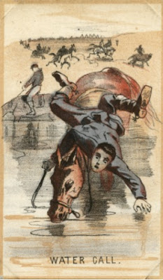
Harper’s admired his talent, and when the Civil War erupted in the American South, the magazine commissioned Homer to follow the Union campaign across the nation and sketch military life. The drawings Homer created during the war were later turned into paintings, and became realistic recordings of life on the war front. Below are some of his sketches of the war.

Water Call, 1864. Lithographic card 
Surgeon’s Call, 1864. Lithographic card


These early sketches are somewhat satirical and humorous. Critics believe this style of Homer’s was intended to be humorous to provide a sense of relief from the seriousness of the war. In Water Call and Surgeon’s Call, the settings remain true to the realities of the war, but the subjects are somewhat exaggerated. In contrast, in his later paintings of the war, Homer illustrates the heaviness life in the camps, achieved through the combination of dark, still scenery with the reserved dispositions of his subjects.   

The Bright Side, 1865. Oil on canvas

After the war, Homer returned to his New England roots. His subsequent paintings have a strong focus on man versus nature, and depict the powerful beauty of the wilderness surrounding humble subjects. In the majority of his later paintings, the contrast between the single subject and the vibrant scenery around him is evident. In paintings like the one below, the power of nature holds much of the viewer’s attention while the subject remains the center. This stark contrast of darks and lights aligns with Homer’s interest in the power of nature.


The Gulf Stream, 1899. Oil on canvas

Throughout his painting career, Homer used both oil and watercolor as mediums. At the time of the Civil War, watercolor was viewed as an “amateur’s medium,” while oil was seen as much more sophisticated. Winslow Homer is credited with the rise of watercolor’s popularity as a professional medium, with his intricate forest and river paintings done entirely in watercolor. In the painting below, Homer once again uses color and light to contrast the power of the landscape with the humble subject.

Old Friends, 1892. Watercolor

I chose to study Homer because I enjoy landscape paintings. Homer’s paintings are special to me because of the way he uses color to portray the shadows and highlights of the landscape. I also like that his paintings are very realistic and detailed, which is something I hope to have in my artwork. I also enjoy working with watercolor, and by studying his paintings I can learn new techniques for this style.

Works Cited (MLA)

Greenhill, Jennifer A. “Winslow Homer and the Mechanics of Visual Deadpan.” Art History, vol. 32, no. 2, Apr. 2009, pp. 351-386. EBSCOhost, doi:10.1111/j.1467-8365.2009.00671.x.

Cole TB. The Bright SideWinslow Homer. JAMA. 2016;315(24):2650–2651. doi:10.1001/jama.2015.14333

Muente, Tamera Lenz. “True-hearted men: Winslow Homer’ s Adirondacks watercolors reveal both kind and cruel men grappling with nature at its most primitive.” Watercolor Artist, Feb.-Mar. 2012, p. 62+. http://go.galegroup.com/ps/i.do?p=ITOF&u=duke_perkins&id=GALE|A342767712&v=2.1&it=r&sid=summon&authCount=1#