Sunday, November 28, 2010
Extra Post
Sunday, November 21, 2010
Kazuo Oga
This image below is one that I finished at the beginning of this year -- a result of a moment of inspiration after glancing at Oga's published art book. It was created with a tablet through Corel Painter and then filtered and adjusted in Photoshop.
Despite his incredible contribution to the art of animation and film direction, the Wikipedia (source 1) page on Oga only has one line of text which states:
Kazuo Oga (男鹿 和雄 Oga Kazuo?, born 29 February 1952 in Akita Prefecture, Japan) is an art director and background artist for many Studio Ghibli anime films. He also published two artbooks and directed an OVA.
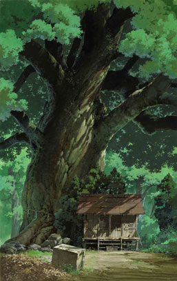
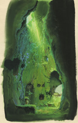
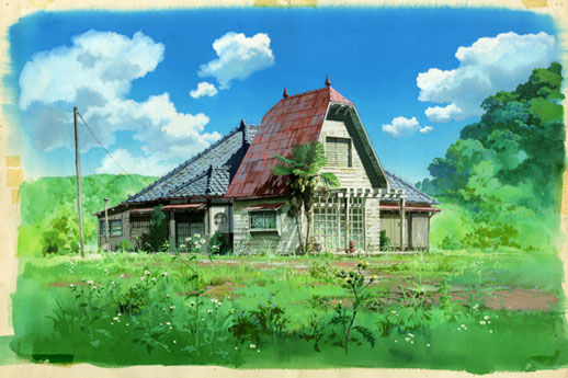

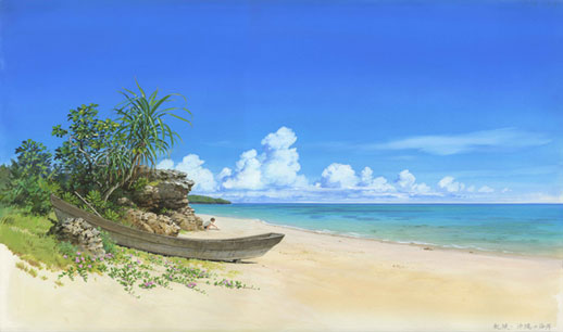
Basically, I use poster-color. Because as we have to paint much, we can't use expensive paint. Poster colors can show brightness or depth of color and, above all, it is easy-to-use. Talking about brushes, I use only two kinds of brushes, hira-fude (flat brush) and sakuyo-fude (pointed brush). For example, a sky or feathering clouds, misty distant mountains, rocks, plants… everything rough is done only by this large hira-fude. Old TV series anime used to be done in this way only. The last finish is done by sakuyo-fude carefully. I paint leaves roughly with hira-fude and add a few detailed leaves on it. Which is enough because the backgrounds of anime are shown only 3 or 4 seconds.
Usually the works are being painted on just barely bigger paper than standard A4-paper, Nicker Poster Colour used with about 30 different colors in bottles. On a wet paper first the basic color surfaces and tones are being painted with a bigger brush, after which you move on to smaller details little by little. Also the straight lines are being painted with a brush, taking support from a ruler and a stick gliding on its groove. A paintbrush is used only very seldom to achieve some certain effects, still most of the painting is done with a traditional brush. Hair-dryers are also being used for drying the painting when needed.


Sunday, November 14, 2010
Extra Blog Post: The Louise Jones Brown Gallery
The most recent exhibition in the Brown Gallery is the work of Lisa Creed. The exhibit displays her work in which she drew one piece of work every day since January 1, 2009. I have never stopped to look into the gallery before, but for some reason this work caught my attention. It was more the concept behind the piece than the actual work that intrigued me. What would your work look like if you had to draw something every day for over a year? What happens if you feel particularly uninspired one day, but you still have to crank out a drawing as not to let down on your commitment? What if you are overwhelmingly inspired one day but are confined to a small 8 x 11 sheet of paper?
It was interesting to see how Lisa Creed approached this situation. As I walked around the gallery, I noticed certain patterns. At times, for a few days at a time, the drawings would all be of the same object or image. Some drawings were the same drawing for days with just slight modifications. Other times, she would draw an object and then change the details of it the next day. Some days, the drawings were very bare and not very elaborate. However, other days, the drawings were very detailed and she clearly spent a lot of time on them. Some drawings were just rough sketches and I couldn't even make out the subject matter. However, other drawings included beautiful paints and detailed colors. You could see what ideas held her interest for days at a time as she continued with these drawings more than once. Other ideas only held her attention for a day and then she was onto something else.
None of the drawings in particular interested me so much that I remember them specifically. I can't remember more than few objects of her work, but what I do remember is the idea behind it. I remember the transformation of certain drawings and the contrast between days when she must have spent hours on one piece and days when she may have spent only a few minutes.
As I finish my senior year at Duke, I have made a personal vow to pay closer attention to these remarkable pieces of art throughout campus. I can't afford to not pay them their well-deserved attention because before long I won't have the privilege to enjoy them anymore.
Wednesday, November 10, 2010
Henri Matisse (continued)

Top left: "Medina: Flowered Trellis"
Top right: "Medina Terrace"
Bottom left: "Medina Terrace and Dome" pencil on paper
Bottom right: "Casbah: The Marabout"
All pen and ink on paper unless otherwise noted. 1912-13
I wanted to include these because they seemed more like the assignments we've been doing in class. On "Medina Terrace," you can see objects in the foreground, midground, and background. I think we can see him getting the rough layout of things and/or developing details that he might have found interesting.
Henri Matisse
Henri Matisse was born on December 31, 1869 at Le Cateau-Cambrésis in the countryside of Nord, France. His father was a corn salesman, and his mother was an amateur painter. Matisse studied law from 1887 to 1891, but then, to his father’s displeasure, he decided to go to Paris to become a painter. He studied at the Académie Julian in Paris under Adolphe William Bouguereau. From 1892 to 1897, he studied at the École de Beaux Arts under Gustave Moreau, who was a very controversial and liberal professor (Cassou vi). While Matisse was a student, he often went to the Louvre and made copies of master paintings there. He met the young Picasso in 1904, and the two became close friends and rivals. Matisse was a major leader of the Fauvist movement mainly from 1905 to 1907, though the style itself lasted beyond that time period (“Fauvism”). Matisse taught young art students at the Académie Matisse from 1907 to 1911. In 1917, Matisse moved to Cimiez, and his approach to art softened considerably during this time period. Matisse died on November 3, 1954.
Matisse was hugely experimental in his artwork, and he changed styles a number of times in his life. His style as a student was pretty impressionistic, then he went wild with Fauvist style. Then he went with a softer, more neoclassical approach, especially after moving away from Paris. He did a few commissioned works and went back to modernist style with his papiers découpés, abstract cutouts in colored paper. In 1908, Matisse wrote, “What I am after, above all, is expression” (The Minneapolis Institute of Arts 3).
Matisse used a number of artistic techniques in his paintings and drawings. Two painting techniques he used were creating an impasto and scraping (D’Alessandro and Elderfield 33). When creating an impasto, a brush or palette knife is used to apply a really thick layer of paint so that it “stands in relief” from the rest of the surface of the painting(33). Matisse often scraped paint, both wet and dry, to change certain elements or emphasize others. D’Alessandro and Elderfield comment that when Matisse scraped dry paint, it seemed almost as though he was not satisfied with how his work looked. With drawings, Matisse showed preferences in tools. He used pencil or graphite mostly for study drawings and softer mediums like charcoal or crayon for his most “ambitious” drawings (35).
Matisse said, “Drawing is of the Spirit and color of the Senses” (The Minneapolis Institute of Arts 8). He used drawing as a “nourishment” and a way to “strengthen [his] knowledge” (8). This drawing process ended when he found “a drawing that empties me entirely of what I feel” (8). Drawing was an emotional process for Matisse, and he felt that line drawing was the most expressive because it was the purest, with the artist only in control (8).
Matisse is considered one of the major influences in the Modernist movement. There were certainly many things leading up to that. I want to talk a minute about Matisse’s involvement in the short-lived movement called Fauvism. The style really got my attention, and I was fascinated by the controversial response to the associated work at the time. Artists associated with the movement were called les Fauves, meaning “the wild beasts” in French. The name stuck after a critic used the term in a description of their work. Les Fauves included Gustave Moreau, Albert Marquet, Georges Rouault, Charles Camoin, Henri Manguin, Chatou, Vlaminck, and Andre Dérain (Cassou ii). The group stayed together from about 1905-1907, generally led by Matisse and Dérain (“Fauvism”). The really notable characteristic of Fauvist painting was the intensity of the use of color. Each color was applied to saturation point without regard to what the realistic color of the subject would be. Lines and brush strokes were really bold. Cassou, curator of the Musée d’Art Moderne, comments, “To give to sensations of colour their most powerful and intense expression, to reorganize on canvas the autonomous play of forms and color, to dethrone the hitherto established hierarchies which exist amongst objects, to demolish once more and then once again, prejudices about beauty and ugliness, these are the tasks which this young artist set himself” (v-vi).
I picked Matisse originally because I came across an article about him in the Spring 2010 edition of the Smithsonian Archives of American Art Journal. I remembered that my final group project in ARTSVIS 54 had a Matisse painting, specifically “The Green Line (Portrait of Madame Matisse),” but I did not really know anything about Matisse. I started researching more of his drawings and found them really interesting, especially because his style is so different from mine. Still, I thought his drawings of the female nude were really beautiful.
Works Cited
Cassou, Jean. Paintings and Drawings of Matisse. New York: Tudor Publishing, 1948. Print.
D’Alessandro, Stephanie and John Elderfield. Matisse: Radical Invention 1913-1917. New Haven: Yale UP, 2010.
"Fauvism." The Oxford Dictionary of Art. Ed. Ian Chilvers. Oxford University Press, 2004. Web. 10 Nov. 2010.
Matisse, Henri. The Green Line. 1905. Oil on canvas. Statens Museum for Kunst, Copenhagen. Statens Museum for Kunst. Web. 10 Nov. 2010.
The Minneapolis Institute of Arts. Minnesota Celebrates Matisse. Minneapolis: Minneapolis Institute of Arts,1993. Print.
Selected Works:
 "The Green Line (Portrait of Mme Matisse)"
1905 Oil on Canvas
This was the painting we used for our final project in 54. The use of color really got my attention, and the work in general is representative of the Fauvist movement.
 (Scanned from Minnesota Celebrates Matisse)
First drawing:
"Reclining Nude" - about 1920 Pencil on paper
I thought the hatching technique Matisse used to describe shapes and contours was really effective here. I might apply it to my own work sometime.
Second drawing:
"Woman with Folded Hands"
about 1919 Pen and ink on paper
The line work is really crisp here, which is something that I could apply in my drawing as well.
 (Scanned from Matisse: Radical Invention 1913-1917)
Left: "Composition No. II"
March 11, 1909 Watercolor

Below: Drawing on verso of letter
March 1909 Ink on paper
I included this watercolor because I liked how we could see the study drawing and modifications Matisse made in the final piece. He also added another leaning figure on the right.


(Scanned from Matisse: Radical Invention 1913-1917)
Left top: "Dance (II)"
summer-fall 1910 Oil on canvas
Left bottom: "Music"
winter-fall 1910 Oil on canvas
Below: "Henri Matisse - Before" and "Henri Matisse - After"
Oct. 8, 1910 published in La vie parisienne 48,51
I also included these pieces because we could see both the study drawing and the final product.
Paul Klee

 Born on December 18, 1879, Paul Klee was a master of many arts, and often combined them into one mixed media piece. He was born in Switzerland to a family of musicians, the youngerof two children, and in fact grew to be quite talented at the violin, which he often played with the Bern symphony orchestra. He lived in Germany where grew to be a teacher of art. Klee was very interested in cubism and liked to keep his works somewhat primitive. He produced over 10000 works of different medias, however he is best known for his water colors. During the peak of his career in Germany, the Nazi party announced that Klee was a "degenerate", andbanned him from all art exhibits. He then returned to Switzerland to continue his passion. Unfortunately just two years after returning to Switzerland, Klee was diagnosed with scleroderma, which is a rare skin disease. He lived five more years, in which he continued to create art.

Jackson Pollock

Jackson Pollock is known as one of the most famous American abstract artists. Born in 1912, he was the youngest of five children and raised in both Arizona and California. Art seemed to run in his family; his oldest brother moved to New York to study under painter Thomas Hart Benton when Jackson was in high school. Soon after, Jackson also moved to New York where he studies many different artists including muralist Jose Clemente Orozca and David Alfaro Siquieros. The large scale and experimental styles of these artists can be seen throughout Pollock’s work. By the early 1940s Pollock started participating in expositions, from which Peggy Guggenheim discovered him. She became is patron and financially supported him for the rest of his life. He did tragically in a car accident in 1956.
Pollock is best known for his abstract “drip” paintings, in which he dripped paint straight from cans onto the canvas. However, he started his career as a surrealist painter, as the style was popular at the time. He soon became a strictly abstract artist being “completely committed to the act of painting in itself, to the possibilities inherent in paint, and to the results of the interactions between himself and his medium.” He was known for his large-scale canvases and murals. Pollock is responsible for introducing a new style of abstract painting that had a large impact both in the United States and Europe.
Below I included a selection of his works that show his changes in style form the beginning of his career to the end. He early paints have more surrealist qualities with some figures and realistic qualities. He then moved into complete abstract paintings loosing all realistic qualities. Pollock still was using vibrant colors and started to experiment with drip paintings at this time. In the last few years of his career he stopped using colors and painted only in black and white. I have chosen three painting that represent the different stages of his career.
I find Pollock’s art very unique and interesting. I n his early work I really like the contrasting colors that he using and how he is able to tie every part of the painting together. I also found his abstract splatter paintings very interesting. They look so simple and like they were just made of random drops of paint, but every drop adds something new to the painting.
Sources:
"Jackson Pollock - Artist Biography." Vincent Van Gogh Gallery - Welcome! Web. 10 Nov. 2010.
"Jackson Pollock Biography." Jackson Pollock Unauthorized. Web. 10 Nov. 2010.
Frank, Elizabeth. Jackson Pollock. New York: Abbeville, 1983. Print.
De Chassey, Eric, ed. American Art: 1908-1947, from Winslow Homer to Jackson Pollock. Paris: Reunion Des Musees Nationaux, 2002. Print.
Norman Rockwell: Greatest American Painter of All Time
Rockwell was 21 years old in 1916 when he joined the Saturday Evening Post, and over the next 47 years, his production of over 300 cover paintings for the magazine catapulted him in the limelight of the American artscape. As the nation experienced numerous historical events such as World War II, Rockwell's paintings always followed suit and masterfully captured the essence of Middle America - the lives, sentiments, and aspirations of the average American under the socio-political environment at that specific time. No other artist have had as much success depicting the archetypal themes and motifs of "Americana".
After Rockwell left the Saturday Evening Post in 1963, he worked for Look magazine and painted comtemporary issues such as the civil rights movement, among others. In 1973, Rockwell established a trust, and five years later, he succumbed to emphysema. Just a year prior to his death in 1977, Rockwell received the Presidential Medal of Freedom, the nation's highest civilian honor.
Perhaps the greatest thing about Rockwell's paintings is how straightforward and traditional they are. Instead of experimenting with abstract and other modern art techniques that many artists of his time relied on, Rockwell relied entirely on a traditional, realistic, lifelike, but yet slightly exaggerated painting style. His figures are all realistically painted, but their expressions are often exaggerated; smiles are pushed as much as possible, and gestural movements are often over-emphasized. This slightly exaggerated way of depiction gives many of his paintings a sense of humor, imbueing otherwise mundane everyday acitivites with a dose of comedy and drama. Rockwell also painted his backgrounds, which consist of iconic American settings (in a diner, at a baseball stadium, in a house, etc.), in a similar fashion - realistic depiction with a touch of exaggeration. These iconic settings and sceneries are often filled with many more objects than one would reasonably find in their actual counterparts, but the inclusion of so much detail isn't done out of self-gratification or indulgence; instead, it seems that Rockwell really wanted to include as many iconic elements as possible in order to elicit a particularly strong sense of connection and fondness in the viewers by over-emphasizing the "Americana" feel of the particular setting.
Speaking of a sense of connection, both Rockwell's subject matter and artistic technique enable him to create paintings that the viewer can relate to. Rockwell's subjects are always middle-class Americans, and almost everything he paints belong to the idealized milieu of a middle-class lifestyle. As a result, when the average American (his intended audience) views one of his paintings, he/she sees individuals of similar socioeconomic backgrounds doing regular, everyday tasks. Undoubtedly, this creats a bond, a connection between the real viewer and the fictional subjects, who aren't really fictional since they are so closely based on real individuals and their everyday lives. The slight humor element (as a result of exaggerated facial expressions) of his paintings give them an extra layer of likeability and attractiveness by injecting senses of comedy and joy into otherwise mundane activities such as eating at a diner, waiting for a doctor in the waiting room, etc. In addition to subject matter, Rockwell's technique also play a major part in helping his paintings "reach out" and form a relationship with the viewer. Because his technique is so traditional and that everything is painted in a realistic and very life-like manner, the viewer doesn't have to navigate through an artistic labyrinth in which a substantial amount of time and energy are used to decipher and understand the technical aspects of the painting's creation. In other words, because his technique is so straight-forward, viewers don't have to struggle to understand and interpret the technical aspects of the painting; instead, they can focus exclusively on the theme and story of the painting, jumping immediately to the narrative and forming that connection with the painting's subjects. Had Rockwell used a more abstract approach, then chances are viewers would spend most of their time and energy trying to figure out what he actually painted rather than focusing on the actual subjects of the painting and the narratives behind them. In essence, Rockwell's paintings are intriguing and meaningful not because of their unique or esoteric technical quality, but because of their ability to clearly portray and slightly romanticize everyday activities that ordinary Americans could relate to. Rockwell's goal wasn't to bewilder or shock his viewers with never-before-seen techniques and artistic styles; he simply wanted to provide heart-warming and humorous narrative pieces that everyone can enjoy and connect with. That's what sets him apart from other famous artists of the time, and that's what makes him so loved and cherished by the American public.
Now let's take a look at some of Rockwell's paintings and how they illustrate theme and that sense of personal connection.


In this painting, we see a heart-warming depiction of a young boy praying with two elderly individuals (probably his grandparents) just before a meal. This close relationship between family members and the activity of praying both strongly evoke fundamental American values and practices of the era, creating a bond between the painting subjects and the viewing public. Also note the detailed depictions of the environments (the cabinet, the window, the table cloth, the cane on the ground, etc) and how they further lend a sense of place and setting to the scene.
Like previous paintings, the two paintings above fully exhit those iconic characteristics of Rockwell's paintings - highly expressive expressions/gestures, familiar and iconic setting, and the presence of a narrative, a scene that natrually depicts a realistic, everyday action/sceneario typical for the average joe.
We've mentioned in the beginning that while most of Rockwell's paintings represent the warm and everyday occurrences of "Americana", some of his works painted in the 1960s steer away from these heart-warming narratives and instead focuses on some of American society's troubling aspects. The painting below depicts racism and the civil rights movement.

Unlike previous paintings, this solemn and depressing depiction (called the Problem We All Live With) ditches the humor, warmth, and iconic Americana setting that characterized his other works. This painting shows a group of African Americans marching in defiance and protest, and the splattered tomato on the wall along with the "N-word" clearly portray a hostile environment where these courageous individuals are being attacked and harassed as they fight for their basic civil rights. Rockwell not only idealized the positive and warm elements of American life, but also portrayed, accurately and without restraint, the dark periods of American history. He did not turn a blind eye to the negative aspects of society; instead, he chose to use his fame and skill as an artist to bring these troubling aspects to light. It is worth noting that the young girl is the only person whose face is showing. By focusing so much on this little girl, who is risking her own welfare by bravely marching with the growups, Rockwell sought to seek sympathy from the viewers by creating a scene that masterfully juxtaposes courage and vulnerability. The girl has a very stubborn and determined face without a hint of fear, even under circumstances where she is vulnerable to physical suffering (suggested by the splattered tomato). Hopefully after seeing how such a young person can have so much bravery and determination (made even more evident by her firmly clenched fist, a gesture echoed by the adults) under such a hostile environment, the viewers will be rallied up and march in support of the noble cause, which is the civil rights movement and equality for all individuals.
After showing some of Rockwell's paintings that depict typical and everyday activities (arguing and praying at the dinner table, waiting in a doctor's office, eating in a diner, etc.), it is tempting to come away with an impression that his paintings are perhaps a bit too simplistic in their depictions. That other than a straightforward narrative illustrating an everyday activity, these paintings do little else. While this is true for many of his works, labelling Rockwell's paintings as simplistic and lacking in subtlety is a grave mistake. Now, let's take a closer look at some of his most cherished paintings that are much, much more than what meets the eye.
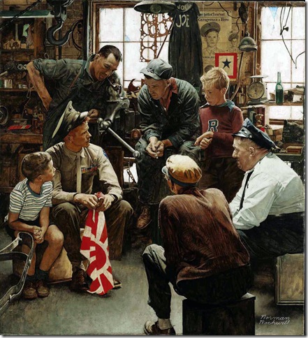
This is perhaps one of Rockwell's most famous paintings, titled "The Homecoming Marine". In this painting, a young United States Marine is shown sitting in his father's mechanical garage/workshop, having just returned from WWII's bloody battlefields. He is holding a Japanese flag, and he surrounded by a group of individuals. The younger children are probably his siblings, while the older adults are probably his father's friends, co-workers, and/or acquaintances. The man on the right with a white shirt is most likely the Marine's father, and in the background on the wall, there is a poster with the Marine's face and the tagline "Garageman a Hero". From a stylistic and technical point of view, this painting is classic Rockwell; the lighting is soft and natural, the figures are realistically and masterfully paintings, and the whole painting illustrates a cohesive narrative - a natural interaction among individuals rather than a contrived and elaboratedly staged "photo-shoot". This color palette in this painting relies heavily on the neutral tones, which fits with the setting of a dingy and rusted mechanical garage/shop.

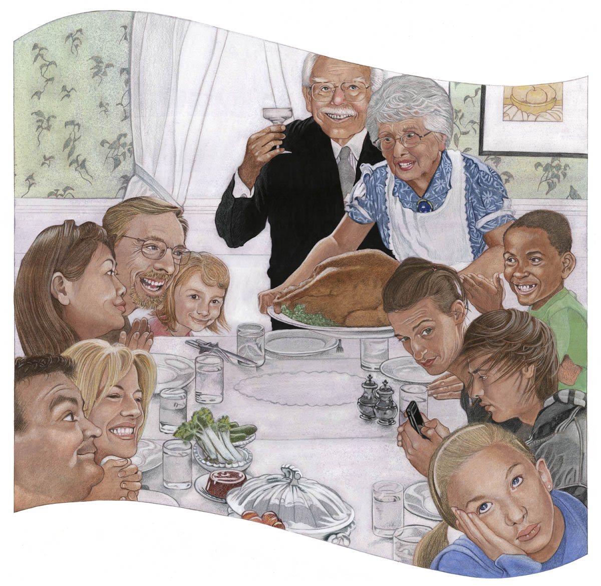
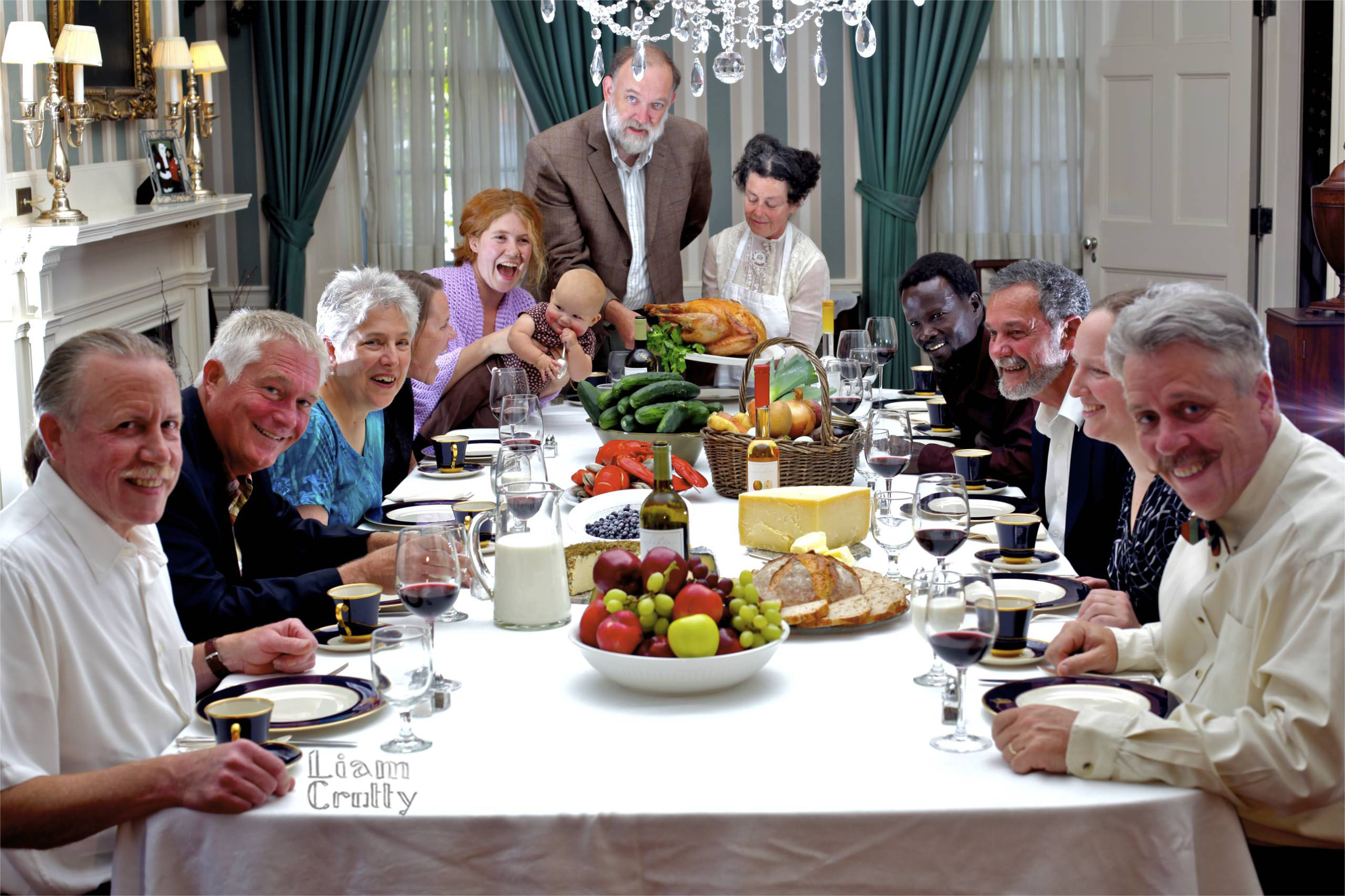
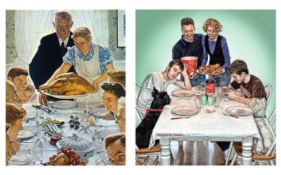


Now, at the very end, let's talk about why I picked Rockwell and how his work influenced me and my work. Rockwell's detailed and meticulous painting style, along with his strict adherence to realism, are the primary reasons why I am so hooked to his art. I also like doing detailed works, and to me, technical proficiency and realism are extremely important; like Rockwell, I want my artworks to tell narratives that people can relate to, and in order to accomplish that, a realistic style is much more effective than a more abstract/surrealistic approach. Like Rockwell, I use live models for many of my works, and like him, I rely heavily on photo references. Below is a side by side comparison of a photograph used by Rockwell and one of his paintings that was shown earlier.

Evidently, Rockwell remains very faithful to his photo references. While for many of his pieces photo reference was used, for others, such as the famous Freedom from Want, he relied completely on actual models sitting in front of him. It is a testament to Rockwell's legendary skills that he was able to paint Freedom from Want entirely from actual people. Without incredible amount of sheer technical prowess, such a feat would be utterly impossible. I am pretty positive that I will never reach the level of expertise of Rockwell, that's why I'll always rely on photo references, not that it is a bad thing. Another element worth noting is that while Rockwell was an oil painter and that all the pieces shown here are done in oil, my prefered medium is colored pencils. So before I end this for good, I thought I'll share two of my most recent colored pencil drawings done in the spirit of Rockwell. Both pieces are done using Prismacolored pencil, on 19x24 Bristol Pads. There are many, many issues in both of these pieces, but for what they are worth, I consider them a decent attempt at capturing the essence and soul of Rockwell's paintings. Hope you enjoy it and THANK YOU for getting through this ridiculously long blog post.


References:
Wikipedia
Norman Rockwell Bronze
Images all taken from Google Image
Gustav Klimt: A Look at the Drawings of a Painter

I have always been a huge fan of the work of Gustav Klimt. Generally, his most famous works are paintings characterized by his abstract use of the female figure and a bold use of color and pattern. Below are two examples of typical Klimt paintings that show this mix of pattern, color and figure.
However, due to the fact that Klimt is known mostly for his paintings, I realized that I couldn’t recall ever seeing a drawing by the artist. Consequently, I decided to do some research into what a Gustav Klimt drawing might look like and if a typical Gustav Klimt drawing looked anything like his paintings. However, coming out of the research, I was moderately surprised because the style of his drawings seemed completely different than the style of his paintings.
On one hand, many of his drawings (while still beautiful) were a lot more conservative, technical, and straightforward than I’d expected without any hint to a deeper conceptual meaning like I was used to seeing in his paintings. His drawings do not use the intricate patterns or colors that have become iconic of his style and if I had not squinted closely at the Klimt signature in the corner I am not sure that I would be convinced that they were in fact works by Gustav Klimt.
On the other hand, I was shocked by another series of drawings by Klimt that were in complete contrast to these conservative and straightforward observational drawings. In fact, some of his drawings were downright provocative; many of them explicitly illustrating female subjects in the process of masturbating. Despite being provocative however, these drawings still had little resemblance to the Klimt paintings. Like the more conservative drawings, these drawings too were drawn without color and pattern and in a very realistic manner whereas the figures of his paintings are often abstract and distorted. In fact, the only drawings that I was able to find that hinted at a patterned and abstract style were the actual plan sketches that Klimt had done in preparation for his paintings (shown below). These sketches are also good because they go along with the process that we have begun practicing in class which involves establishing a planned sketch in anticipation for a final piece.


