Sunday, October 31, 2010

Artist: Satoshi Kon


In light of the recent death of one of my all-time favorite anime directors Satoshi Kon, I wanted to spend my blog post sharing some of his work. Satoshi Kon, veteran director at the Madhouse ltd., is the mastermind behind the groundbreaking new-age anime films Paprika and Paranoia Agent, as well as the critically acclaimed psychological thrillers Tokyo Godfathers and Millenium Actress. Arguably, Satoshi Kon's dramas are just as powerful both aethetically and dramatically as some of the anime directors best known to the Western world including Hayao Miyazaki and the ancient Katsuhiro Otomo.

Here are some sample clips from his films:


Aesthetically, scenes from Kon's films are typically colorful and visually effective. Kon's later films layer backgrounds and lighting to create papery u-kyoe effects, heavy silhouettes, and colorfully illuminated streets and sky lines. Story boards for Kon's films are often drawn entirely by Satoshi Kon himself. In addition, Satoshi Kon often uses variations in traditional anime drawing such as simple flattening colors/color texture, transparency, and brightness to transition between alternate realities and shifting moods in more recent films like Paranoia Agent and Paprika. In these films Kon pushes some of the boudaries in drawing by illustrating impossible shape shifting between an objective reality and the worlds of dream and cyber life.
Satoshi Kon's work also has a challenging level of depth and irony that bring to life the characters and world he creates. One of my favorite examples of this is in Satoshi Kon's Millenium Actress, where Kon revists in his own work, the history of World War II actress Chiyoko Fujiwara. Here, Kon adopts the traditional cinematic styles from WWII Japan to show the life and film journey of the actress. The centerstage of film is Chiyoko Fujiwara herself, who chases an unknown man through movie after movie, each time essentially playing out versions of her own life/search through different film mediums.
Film Trailer from Millenium Actress:

Two related links on Satoshi Kon:


Also worth looking at is background art from Makoto Shinkai:


Saturday, October 30, 2010

Musings

This past week has been pretty "artsy" in terms of cultural art and music exposure. I had a few productive a cappella practices, went to the Muse concert, spent a lot of extra time in the Smith warehouse catching up on work, went to the Passion Pit concert, watched Into the Woods, signed up for a spot on the Perkins mural, and registered for an animation class for next semester. So, instead of writing a feature on an artist in particular, I feel like just sitting down on this brisk pre-Halloween festivities afternoon and typing up an informal blog post. Hope you don't mind my ramblings.

So, we had our little individual discussions with Prof. Fick this past Friday and I voiced my primary worries about drawing with traditional mediums. As you may or may not know, this is my first formal art class and, prior to this, I have never even touched charcoal. It has been such a challenge trying to familiarize myself with the tools of the trade as well as the sheer size of the drawings. I mean, seriously, I can barely fit a standard 8.5x11" page much less these giant bristol boards! Utilizing all that space has definitely been something of an obstacle I've been grappling with.

Regardless, my intention isn't to complain. I just want to talk about the merit in exploring various mediums in art. I have only drawn digitally (with a Wacom tablet), so it's easy for me to constrain my innate sketchy and expressive lines through consistent line art-ing as well as cleaning with layers and filtering. Drawing digitally is something of a hobby, and here's a piece I did about a year ago to date -- in which I saved the process of sketch, line art, color, filter correction, etc. This process is seen in the series of photos below:


Basically, this process has been my tried and true method for a lot of these little hobby pieces (1|2|3|4), with a little bit of painterly expression in between. I think it's interesting how challenging/tough it is to translate this method to traditional mediums like charcoal with paper. I supposed right now I'm just frustrated with how to find a way to draw "cleanly" without compromising fluid lines and tonal depth.

Because of this, I want to share a really inspiring artist with everyone. She has (not only) truly created a method totally unique, and it's also a process that really works for her. I find it amazing that Alexa Meade can create such incredible images with such an individual approach. From her "About":

Alexa Meade has innovated a Trompe-L’Oeil painting technique that can perceptually compress three-dimensional space into a two-dimensional plane. Her work is a fusion of installation, painting, performance, photography, and video art.


Rather than painting a representational picture on a flat canvas, Meade paints her representational image directly on top of her three-dimensional subjects. The subject and its representation become one and the same. Essentially, her art imitates life on top of life.


Meade’s approach to portraiture questions our understanding of the body and identity. Meade coats her models with a mask of paint, obscuring the body while intimately exposing it, creating an unflinchingly raw account of the person. The painted second skin perceptually dissolves the body into a 2D caricature. The subjects become art objects as they are transformed into re-interpretations of themselves. In turn, the models’ identities become altered by their new skin, embodying Meade’s dictated definition of their image to the viewer.


Meade’s project plays on the tensions between being and permanence. The physical painting exists only for mere hours and is obliterated when the model sheds its metaphorical skin. What endures is an artifact of the performance, a 2D photograph extracted from the 3D scene. The photographic presentations create a tension between the smoothness of the physical photographs and the tactility of the painted installations captured within them, blurring the lines between what is depicted and depiction itself.

Her approach to her art is so interesting and the product is equally as interesting and innovative as her process:


While this "painting" looks like it was done on campus, Alexa actually painted in a 3D setting -- complete with the man and the props as depicted. This piece is a photograph. Here's a picture from her Flickr of her creating an installation:


I think the main challenge for any artist, professional or amateur hobbyist, is to find a medium that they love to work with. Alexa Meade has found that medium through, I'm sure, a lot of trial and error experimentation. I guess part of that process is to play around with a lot of different methods -- be it sculpture, paints, watercolors, charcoals, etc. Thus, I think that this Drawing 100 class has been an enlightening experience. It has challenged me to find new ways to work with new tools and, hopefully, I'll find a way to achieve expression without compromising line fidelity through charcoal and graphite.

I find Meade to be quite the inspiration. Take those tough materials and make them into something that's yours and yours alone(!)

Cheers,
Chao

Thursday, October 28, 2010

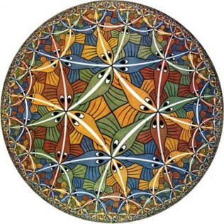
MC Escher


Circle Limit III, 1959. Woodcut, second state, in yellow, green, blue, brown, and black, printed from five blocks.
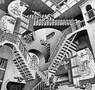

Relativity. 1953. Lithograph.


Drawing Hands, 1948. Lithograph.

M. C. Escher, whose full name was Maurits Cornelis Escher, was born on June 17, 1898 in Leeuwarden, Netherlands, and died March 27, 1972 in Laren. He was a graphic artist best known for his realistic prints that played with weird optical and surreal effects. He used lithographs, woodcuttings, and engravings to portray "impossible" spaces. In 1919, he attended the Haarlem School of Architecture and Decorative Arts. He began studying architecture, but then switched to decorative arts, where he studied under Samuel Jessurum de Mesquita. One of the reasons he turned to art was that he felt images were the best way for communicating his ideas to other people; they were graphic, not literary, concepts. He left the school in 1922 and traveled through Italy and Spain. He met Jetta Umiker in Italy and married her later in 1924. They lived in Rome until 1935, when the political tension caused by Mussolini drove them to leave for Switzerland. They had a son in Rome, named Giorgio Arnaldo Escher. They moved again in 1937 to a town near Brussels, but then, in 1941, World War II forced them to move to the Netherlands, where Escher remained until 1970. Most of Escher's more famous works come from this period. In 1970 he moved to a retirement home for artists in Laren, and he died there in 1972.


His art is also known for its unique mathematical qualities, and his work in fact has influenced the field of mathematics. He portrayed mathematical relationships between figures, places, and space. One of his greatest mathematical interests was in regular division of planes and symmetry. Escher was influenced by George Polya's academic writings on plane symmetry groups, which his brother, Berend, sent to him. This inspired Escher to more heavily incorporate mathematics into his art, starting in 1937. In 1941, Escher wrote his own paper, Regular Division of the Plane with Asymmetric Congruent Polygons, detailing his mathematical approach to art. In this paper, he studied color-based division, and developed a system of categorizing different combinations of color, shape, and symmetrical properties. This area was later labeled crystallography by mathematicians. Escher also experimented with other mathematical concepts in the 50s, such as representing infinity on a two-dimensional plane.

I was interested in Escher's art because it portrays an "alternate" reality in which the laws of the world we live in don't seem to apply. I always felt that one of the most beautiful qualities of art was that it could be used to distort, skew, and create new worlds. I think Escher's application of math to art is intriguing because, so often, they are viewed as being opposites, with math as a rational force and art as an irrational, emotional one. Thus, his combination of the two brings a fresh perspective to art.


Bibliography:

Maurits Cornelis Escher. M. C. Escher: The Graphic Work. Taschen, Germany. 2001.

"M.C. Escher." Encyclopædia Britannica. 2010. Encyclopædia Britannica Online. 28 Oct. 2010 <http://www.britannica.com/EBchecked/topic/192344/M-C-Escher>.

"M. C. Escher." Wikipedia.org. 28 Oct 2010. < http://en.wikipedia.org/wiki/MC_Escher>

Monday, October 18, 2010

Vasily Kandinsky


I have an affinity for paintings with music or musicians as subject matter, so I started out looking for an artist who shared my fascination with this art-within-art theme of music in painting.
I stumbled across Kandinsky, who, though he never explicitly painted musicians or instruments, conveyed a sense of music through abstract forms, described his work in musical terms, and philosophized on the similarities between painting and music and the commonalities between all art forms.

Vasily Kandinsky was born December 4, 1866 in Moscow. He completed a full education in law before deciding to become a painter and was thirty years old when he went to Munich to begin his art studies. In his autobiography, Kandinsky recalled seeing Monet’s Haystacks, in which he felt color was more important than the objective subject matter, which may have been part of the impetus for the abrupt change.


While Kandinsky was beginning to develop technical artistic skills, he was more advanced in his understanding of aesthetics and artistic philosophy. He taught art and published essays and reviews before becoming known as an artist. His early independent work, dating to about 1900, depicted landscapes and shows the development of his ability to capture the real, visible world around him. During this phase, he painted The Blue Rider (below). He travelled much and dabbled with various artistic styles and methods, including Impressionism, Art Nouveau, and Neo-Impressionism.


In 1908, Kandinsky’s paintings began to take on a different quality, reflecting a clarification of his analytical thought, and perhaps a reconciliation of his artistic philosophy with his artistic ability. Paintings have a cleaner application of color, and there is less concern with verisimilitudes- over time, objects became more abstracted and increasingly expressive, and colors and shapes became autonomous from actual objects. In these pre-WWI years, Kandinsky completed the first seven of the ten oil paintings he titled Compositions – Composition VII is shown below.


With his foundation in artistic theory and his newfound power of abstract expression, Kandinsky became the leader of an influential avant-garde movement. He helped form create two art associations, the Munich New Artists’ Association in1909 and the Blue Rider in 1911. He also published his principal theoretical treatise, titled On the Spiritual in Art. This document envisioned an ultimate form of art, in which music, color, and movement were fused on stage. It also argues for abstraction, which Kandinsky saw as a means for the human spirit to triumph over material.


Kandinsky’s painting took a new turn in the post-WWI years. Outlines and shapes became more cleanly defined, and the perfect circle, later a reoccurring theme, was introduced. In 1922, Kandinsky became a teacher in the Bauhaus school, which reunited the fine arts with the crafts. His Bauhaus style became distinct from both his earlier and later work – it featured floating geometric shapes – circles, wedges, lines, grids, half-letters, crescents, and other fragments. An example highlighting Kandinsky’s frequent use of circles is Several Circles, below.


With increasing attacks from rightist political attacks in Germany, the Bauhaus school closed, and Kandinsky escaped to Paris. Here, his art made its final transformation, with the “amoeba” shape becoming central to his works. Kandinsky began to favor biomorphic shapes, irregular lines, and paler colors. An example from this time period is Reciprocal Accord, shown below.


References:


Messer, Thomas M. Kandinsky. New York: Harry N. Abrams, Inc., 1997.


Weiss, Peg. Kandinsky and Old Russia: The Artist as Ethnographer and Shaman. New Haven, Connecticut: Yale University Press, 1995.


Friday, October 15, 2010

The Dance Class- Degas

file:///Users/kms73/Desktop/danceclassdegas.jpg

SOOOO, thinking along the lines of empiricism, I looked up a few of Degas' works to help me understand the role of perspective in my own drawings. I love particularly his paintings of the dancer's in their practice studios because there are a variety of subjects and the fore/mid/background are very distinct.
In this particular piece, the foreground consists of two girls on the left hand side of the painting (one is sitting on a piano). They are large and prominent and don't block the mid and background, but rather frame the work and aid the eye's movement through the piece. The midgroundhas a few ballerinas walking along the edge of the room, but is mostly characterized by the male instructor who [I assume] is giving them instructions. In the background the girls are adjusting their skirts and getting ready to perform, but are much much smaller compared to the girls at the piano.
The perspective Degas presents is evident through various aspects in the painting. He uses linear perspective with the lines of the floor boards and the room itself to create a feeling of a receding space. He also uses empirical perspective by positioning himself in a [I think seated] position among the figures, and changing the size of the figures from the place where he is sitting in the foreground compared to the girls in the background. He places the teacher in the middle to establish a strong midground, and the teacher [as he should be] is smaller than the girls in the foreground.
I also like how he uses his impressionistic style to define perspective in the piece. Impressionism is characterized by "imperfect brushstrokes" and "unblended colors". In the foreground, Degas' subjects seem pretty clearly defined and have sharp edges about their clothing and bodies. However, as one's eye travels from the front of the classroom to the back, the brushstrokes become less defined, as if a near-sided person is looking at the scene. This difference in the quality of brushstroke adds another layer of depth to his painting, and maybe it would be useful or fun to try something similar in my drawing!!