I have always thought that looking at someone’s drawings is like having a window into their thought-process. By stripping things back to the most basic, essential form of art — nothing more than mere pencil and paper — drawing, for me, is a powerful means of self-expression. Even if everyone uses the same pencils, paper and subject-matter, no two drawings are ever the same. This variation in artistic styles that makes drawing an intensely personal process for me, as every drawing provides an insight into an artist’s personality, mood and character.
It was striking to see and discuss the drawings of different members of the class each week. Even though everyone had the same assignment briefing and raw materials, our end products were strikingly different. Some people used heavy tone and bold mark-making, while others opted for much softer lines. Some people used cross-hatching and contrasting textures, while others went with smoother gradations in tone. Compositions also differed radically, in terms of what people chose to include, the angle adopted, and the scale of the objects. These differences — both technical and compositional — gave every piece a distinct feel.
I was drawn to drawing by this powerful sense of individuality. The simplicity of the elements involved in the process — just a stick of graphite or charcoal — really emphasised these contrasts in styles for me. By the end of the class, when Professor Fick pinned people’s drawings to the wall, my classmates’ different styles were immediately apparent and recognisable. Every choice about composition, structure, tone and mark-making provides an insight into the artist’s thought-process: how they process things; how they express themselves. The class taught me that as much as you can learn the techniques and methods of good drawing (how to show depth, use perspective and so on), there is much more to it than that. Drawing is also a deeply personal process; there is no one “right” way to draw. This sense of freedom, self-expression and lack of defined answers attracted me to drawing as welcome contrast from regular class work.
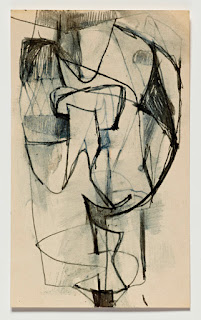
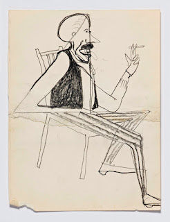
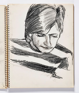
Back in high school, my art teacher always used to tell us: “every good artist, without exception, starts by drawing well”. Reflecting on this semester of drawing, I have to agree with him. Drawing, to my mind, is the cornerstone of all art: the foundation of everything that comes afterwards. To master painting or sculpture, the first step is putting pencil to paper. Nowhere did this become more clear to me then looking at some of Richard Diebenkorn’s works while visiting my brother at Stanford University in February. Diebenkorn is famous for his paintings — particularly his “Ocean Park” series — which are instantly recognisable on account of their angular lines and focus on shapes. Although his paintings are striking in themselves, they were even more impactful when seen in the context of his sketches. Diebenkorn referred to his sketchbook as his “portable studio”: the place where he was free to experiment and hone his artistic approach. The drawings shown here provide an immediate insight into his style — sharp mark-making and strong tonal contrast — that also comes through clearly in his paintings.
Furthermore, beyond Diebenkorn, I think that all the art I have seen this semester — Monet and Giorgione at London’s Royal Academy, Delacroix at London’s National Gallery, the Nasher Museum collection here at Duke, and the Ackland Museum collection at UNC Chapel Hill — stems from the essential foundation of drawing.
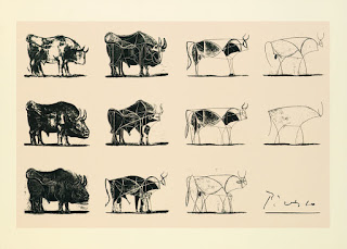
Drawing continuously over the course of the semester has been a powerful experience for me. It has challenged me to create engaging compositions, to develop my personal drawing style, and to improve my ability to observe. What makes drawing so powerful, for me, is the process of simplification and reduction that it involves, taking art back to its most basic, striking form. This is shown emphatically in Picasso’s famous depiction of a bull in a series of lithographs, each one more simplified in its lines but conveying the animal’s distinctive shape and character equally well.
The fact that that the world’s largest company, Apple, uses Picasso’s simplification of the bull to teach its new employees the importance of reduction shows the power of drawing as a way of processing information. Picasso’s lithographs have also shown me that effective simplicity is harder to achieve than it may appear. Likewise, the journey of developing my own drawing style over the course of this semester has been a challenging but immensely rewarding learning experience.
Sources
"Richard Diebenkorn’s Career Viewed Through His Sketchbooks," Cantor Arts Center at Stanford University, http://goo.gl/g2k0WC [Accessed 04/16]
"How Apple Uses Picasso To Teach Employees About Product Design," Fast Co. Design, http://goo.gl/xfgxiR [Accessed 04/16]


No comments:
Post a Comment