Sunday, October 4, 2015

Marcel van Eeden - Alex Villeda


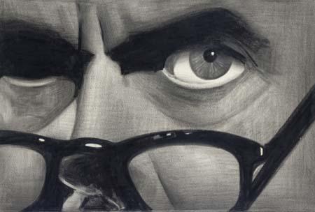
Marcel van Eeden is a Dutch artist, born on November 22, 1965.  Growing up, drawing was just something he did to past time, and it wasn’t until he was working in an insurance office that he realized he wanted to be an artist.  He saw it as a way of giving himself freedom, and at the age of 24, began to study painting at the Royal Academy of Art.   He always draws from photographs and he always makes sure the photographs were taken prior to his birth.  In his words:

“The first and most important thing is that I wasn’t alive at the moment the picture was taken.  Then I can see the moment, I can see the light that fell, and even though I didn’t exist at the time, I can recreate that moment.  It should be a frightening thought, but it’s not.”
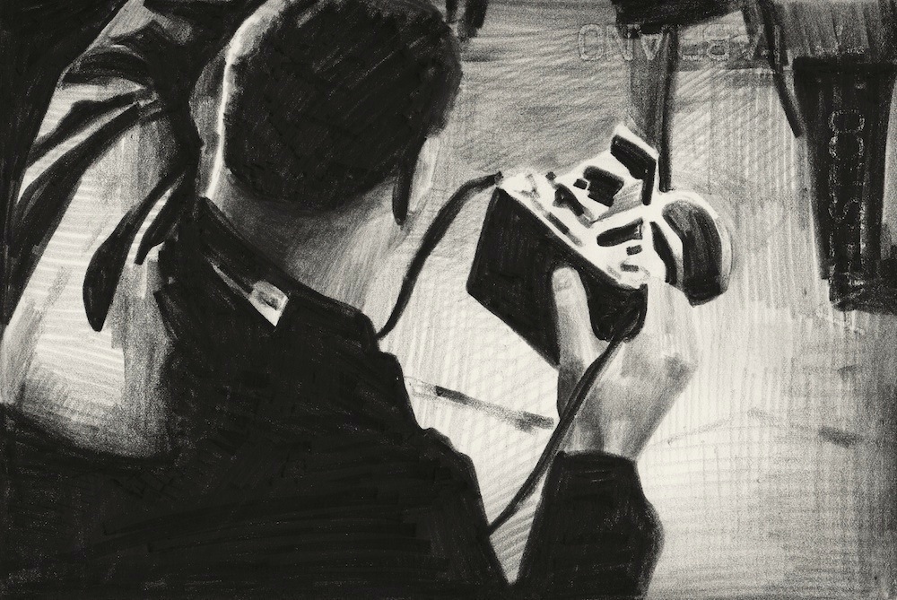
                             From "The Photographer" 1945-1947.  Series of 43 Drawings.
A fan of literature and comics, he uses words in a lot of his drawing series.  The material he uses is called “Nero” and it comes in pencils and chalks.  Rather than focusing on the line, he concentrates his efforts on showing the grey tonal composition of the source material and the manipulation of black-and-white contrast.  


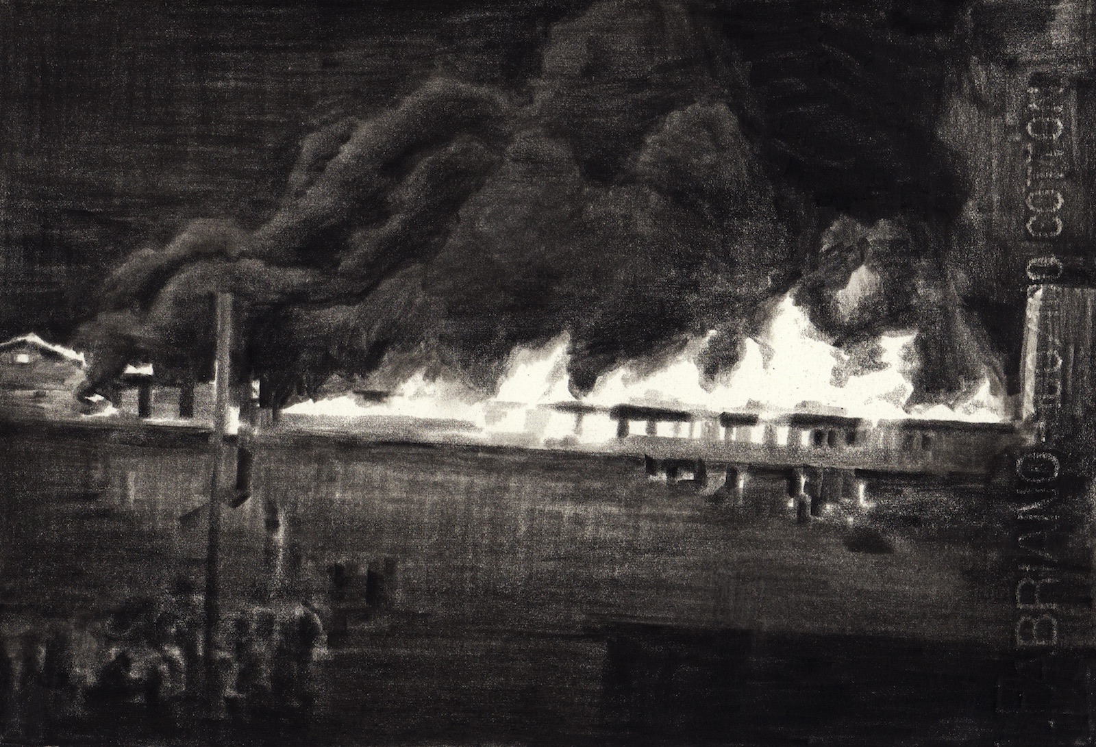
His favorite subject to draw is explosions.

                                         From Cat 9: "Explosions"

I picked this artist because I really loved the way he manipulates contrast and shows depth in his drawings.  The drawing of the bus is probably my favorite because of how the bridge at the top is barely visible, but the smearing of the negative space gives makes it look foggy.  I don't know if that was intentional or not, but this drawing really stood out to me.  


Valli, Marc, and Ana Ibarra. Walk the Line: The Art of Drawing. London: Laurence King, 2013. Print.

"Marcel Van Eeden." Wikipedia. Wikimedia Foundation, n.d. Web. 04 Oct. 2015.

"Marcel Van Eeden « File Magazine." Marcel Van Eeden « File Magazine. N.p., n.d. Web. 04 Oct. 2015.
Albrecht Durer, a native of Germany, lived from 1471-1528, at the height of the Northern Renaissance. He was both a painter and a draughtsman, but his graphic work have received much more attention than his paintings in the centuries since his death, and he is best known for his engravings. Giorgio Vasari credited Durer with possessing the gifts he associated with the Tuscan tradition of painting, an extremely high compliment given that Durer was not Italian. In fact, Vasari's compliments towards Durer closely echo those he gave to Italian greats Michelangelo and Raphael. 

Durer took an interest in drawing early in his childhood. Many of his childhood drawings are in museums today, including one of particular interest: a self-portrait now in Vienna that was done in 1484, when Durer was 13. Though imperfect, it shows knowledge of drawing technique and a talent for portraiture. 
Self-Portrait, 1484

That same year, Durer's father took him as an apprentice is his goldsmith shop, which further educated him on modeling and design techniques. Durer later told his father that his true interest laid in painting, and he was tranferred to a three-year apprenticeship with a local religious painter named Michael Wohlgemuth. Durer likely learned the basics of wood engraving in Wohlgemuth's studio as well. Other major influencers on Durer's work include German artist Martin Schongauer and Italian artist Mantegna. 

From 1505-1507, Durer worked and studied in Venice. While there, he picked up the practice of utilizing preparatory drawings in lieu of pure underdrawings in preparation for his paintings, which he first practiced with his painting the Feast of the Rose Garlands. Durer's portraits of Emperor Maximilian I are particularly interesting because Durer first painted the Emperor not from life, but from a single preparatory cartoon, ultimately producing a drawing, a woodcut, and two paintings. 

Portrait of Maximilian I, 1518

In his drawing Head of a Woman, Durer returns to the Venetian technique again, using a gray base with black and white highlights added on, demonstrating the importance of that trip on the entirety of his career.  

Head of an Angel, 1520

Durer's last work was a drawing of Christ on the Cross, though the face was left incomplete due to his passing. Durer died in April 1528 after a brief illness. 


Michelangelo Buonarroti


In 5th grade art class, my teacher taught a unit on Michelangelo and made everyone do a Sistine Chapel drawing. We taped a sheet of paper to the underside of our desks and lied on the ground underneath it, attempting to scribble with what fifth grade artistic abilities we had. Ten minutes in, I had to pee and 15 minutes in, my arms ached, and then I spent the rest of the class wondering how Michelangelo painted an entire ceiling without his arms falling off. The imitation of Michelangelo’s work might have been lost on fifth grade me, but the awe of his art stayed all these years.

Michelangelo was born on March 6, 1475 in Caprese, Italy, and became apprenticed to Domenico Ghirlandaio, a famous painter, at an early age [2]. Soon after, he was chosen to study at the Humanist academy, founded by Lorenzo de’ Medici, the de facto ruler of Florence. The political upheavals of the time forced Michelangelo to move in and out of Florence, but during it all, he continued to sculpt and draw and expand his artistic repertoire. Although he lived most of his life in Rome, he always considered himself a Florentine [1]. His most notable works include the ‘David’ and ‘Pieta’ statues, and the Sistine Chapel ceiling. Michelangelo died in 1564 at the age of 88, but his art remains ageless as its influence spans to modern day.


Group of Two Figures, after Giotto [3]
Pen and Brown Ink on Paper
1488

This was one of the earliest known works by Michelangelo, completed when he was around 15 years old. This quill and ink sketch is based on Giotto’s fresco The Ascension of St. John. Michelangelo was drawn to Giotto’s works because of the weight and gravity of the figures and the unique orientations and gestures of the people within them. Even at the age of 15, Michelangelo shows talent beyond his years, which can be seen in the detail hashing in shading.


Preparatory Drawing for the Ceiling of the Sistine Chapel [3]
Red Chalk and Pen and Brown Ink on Paper
1508

How did Michelangelo even start painting the giant ceiling? He started with a sketch. This is only one of many preparatory sketches he did for the Sistine Chapel, though he burned most of them, hoping that people could see only his finished product. This sketch shows several figures, quickly drawn, with no real collection between them, meaning Michelangelo used this to practice poses for the over 250 figures that appear in his actual ceiling painting. Once again, his shading is precise and controlled, and contrasts the straightness of the architectural sketch in the top left corner.


Pieta [3]
Black Chalk on Paper
1540s

Towards the later part of his life, Michelangelo created several pieces of art for a close friend, Vittoria Colonna, one of which was the drawing Pieta. At the same time, he was reinventing the art of drawing in a time where pencil to paper was often a discarded preparatory medium for sculptures and paintings. This drawing emphasizes symmetry and focus, with the darkest shading at the center and light sketches on the edges.


[1] Editors, B. (n.d.). Michelangelo Biography. Retrieved October 4, 2015, from http://www.biography.com/people/michelangelo-9407628
[2] Ventura, P. (1988). Michelangelo's World. New York: G.P. Putnam's Sons
[3] Wallace, W. (2012). Discovering Michelangelo: The art lover's guide to understanding Michelangelo's masterpieces. New York, NY: Universe Publishing.

Beautiful Strength

Elizabeth Catlett was born on April 15, 1915 in Washington, DC. Her father worked as a professor at the Tuskegee Institute and passed away prior to her birth. Her mother was educated as a teacher and worked as a truant officer in Washington’s public schools. She grew up listening to stories about enslavement from her grandmothers and witnessing the harsh realities of being black in America from her mother. These experiences taught her about the suffering and exploitation of African-Americans in the United States. She expressed an interest in art at an early age and these narratives helped to shape her artistic vision. Her art work features the life of Mexican working-class women and history of African-Americans particularly racial injustice and the struggle for civil rights. In 1931, she graduated from Howard University, a historically black university in DC, cum laude with a degree in art. As an undergraduate, Catlett studied design, drawing and printmaking with Lois Mailou Jones, James Lesesne Wells and James Porter who were prominent black artists of the Harlem Renaissance.
She received her M.F.A. from the State University of Iowa in 1940. For her master’s thesis, she created Negro Mother and Child, a sculpture that symbolized black women’s love, beauty, strength and resistance. Her sculpture challenges the popular belief that black mothers were only mammies but lacked the maternal instincts toward their own children. Catlett often uses her art to debunk stereotypes about black and brown people. Her intimate relationships with her mother and maternal grandmother shaped her understanding of black women and maternity with their children which also influenced this piece. The piece was awarded first prize in sculpture when exhibited in the 1940 Chicago American Negro Exposition. The theme is reflected in much of her work. 
Negro Mother and Child, 1940
She also depicted this theme using lithograph. In this print, Catlett focused on tonal gradations. She used deep shadows and bright highlights to make them appear almost sculptural. I love how this piece balances the beauty of a relationship between a mother and child and the strength in the arms of the mother. The shading from the lighting in the piece helps to define the arm muscle. The piece also makes the mother and child appear physically connected which also can reflect an emotional connection.
Mother and Child, 1944
In 1945, she received a Julius Rosenwald Foundation grant to create a multimedia series on the theme of "The Negro Woman." to illustrate the identity of black women over time. The following year, she decided to go to Mexico to work on the project. One of the pieces of the series was entitled Bread (or the Right to Eat). It celebrates the concept of agrarian reform in Mexico. The piece features varying line weights and also uses the technique of negative space. The use of negative space brings out the wheat featured in the background. 
Bread (or the Right to Eat), 1968

She also used her art as a form of activism. Catlett addressed the most disturbing injustices against African Americans including lynchings and beatings. She created one of her best-known sculptures, Target in 1970 in response to the police shooting a Black Panther. It shows a black man's head framed by a rifle sight, a response to both the Vietnam War and the terror in black ghettoes. The piece raises awareness about issues of police brutality.
Target, 1970
In January of 1970, her work was featured in Ebony magazine in an article titled “My Art Speaks for Both My Peoples,” bringing her increased visibility and notability. I appreciated her work because despite her fame, she always remained committed to depicting the experiences of black Americans. I love how she uses her work as social justice like in “Target”. She inspired me to think about how drawing techniques create experiences like struggle but also the relationship between strength and beauty as many of her pieces depicted.   

Sources:
Herzog, Melanie Anne. "Elizabeth Catlett (1915–2012)" American Art 26.3 (Fall 2012): 105-109
Herzog, Melanie Anne. Elizabeth Catlett: an American artist in Mexico. Seattle: University of Washington Press, 2000. Print.


Jackson Pollock

January 28, 1912 – August 11, 1956


Jackson Pollock was not just an artist. He was also an inventor. His style of painting on the floor created a whole new style of art called abstract expressionism. Pollock believed that art had more to do with the process than the result of the image produced. Critics enjoyed his work because they felt that they could imagine how his paintings were made. They looked at his paintings and envisioned how the paint landed on the canvas; was it a big arm movement, a drip from a paint brush, or a spill from a bucket. Pollock’s work clearly and uniquely demonstrates physical expression in art. It is an interesting style that few people have had success imitating.

Pollock found inspiration in surrealism, and was interested in artists like Digo Rivera and Pablo Picasso. It was Picasso's work that showed him a new perspective of European art, which he previously felt was less valuable than American art. At this crucial time in the middle of the World War, Pollock had a great deal of emotions to express He worked to produce art that could simultaneously move people and allow him to express himself. One day, Pollock realized he did not need to chain his canvas to an easel like all other artists before him. He put his canvas on the floor and literally threw paint at it in as many different ways he could think of.

Though it may look like a series of scribbles and nonsense, these paintings are actually particularly famous for their randomness. It is very difficult to fill a canvas with paint without some sort of repeating pattern. But Pollock managed to create a board filled with noise, where there is no focal point and no single stroke or area stands out more than anything else. It is crazy, random, frustrated even. But at the same time, it is somehow also collected and structured. Some compare his work to the chaos and harmony of nature -- and certainly see that as representative of the war. Whether Pollock was painting nature, the war, his emotions, or absolutely nothing at all, his art made people feel because his process is so vivid. This is what he believed was important.

Pollock had strong beliefs that influenced many. He was known to sometimes record himself making art in unusual ways so that he could later see the process. He used everything as a paint brush, from rocks and sticks to even turkey basters to spill paint onto the canvas is different ways. Pollock is also quoted saying “look passively and try to receive what the painting has to offer and not bring a subject matter or preconceived idea of what they are to be looking for.” 

Pollock died tragically at the young age of 44 from driving drunk, but not before he revolutionized American art forever.


Works Cited

http://painting.about.com/od/colourtheory/a/Pollock_paint.htm

https://www.khanacademy.org/partner-content/MoMA/moma-abstract-expressionism/v/moma-painting-technique-pollock

http://www.jackson-pollock.org/


Friday, October 2, 2015

The Art of Mark Rothko by Sarah Hong

Untitled, 1945, oil on canvas


Untitled, 1944, pen and brush and ink and pencil on paper

Take a second to look at these two artworks. They are both untitled and by the same artist. Can you guess the artist? Though the artist had employed two very different mediums for his works, it’s not too difficult to identify their thematic similarities. Both works showcase the mastery of fluid and translucent pictorial techniques that portray the very nature of organic processes instead of accurate depiction of the subject matter. Now take a look at the painting below. We all recognize that this work is by Mark Rothko, one of the most famous Abstract Expressionists in the history of contemporary art. Would you be surprised if I was to tell you that all three of these artworks are by Mark Rothko? But it is true. The first two artworks that are very different from his signature style is also by Mark Rothko. We could consider the first two pieces as evolutionary, embryonic previews of Rothko later work. Prior to his signature style in the 1950s, we see his surrealistic depictions that are elusive and mysterious with their evanescent shapes, colors, and tones that precede his large-scale, color-field paintings. What’s interesting is that although Rothko was moving towards complete abstraction, he resisted being defined as an abstract artist. Perhaps, by observing the Rothko’s evolution of style, we could grasp the reason why and understand that his focus is not creating a complete abstraction but to convey a variety of depictions in a simple, universal language. 
Violet and Yellow on Rose, 1954, oil on canvas 
By the winter of 1949-50, Rothko had arrived at his signature style, one of which two or three luminous color rectangles arranged one above another appeared to float within a radiant color field. These paintings are notable for its ungainly size as well as the use of horizontal bands of color set against a warm-colored background. Another remarkable aspect of Rothko's techniques is his use of light. To achieve the effect of light emanating from the very core of his painting, Rothko stained pigments into his canvas by applying numerous thin layers of color one over the other. This layering coats of paint allowed him to re-create, in a contemporary manner, the resonant light of Rembrandt Harmenszoon van Rijn, a Dutch painter from the Dutch Golden Age of the late 1600s, whom he very much admired. 

What makes Mark Rothko’s works my favorite paintings of all time is that beyond their large scale and bold presence, there’s something very intimate and emotionally compelling about each one of his paintings. And this aspect, in fact, was one of Rothko’s major goals, which is to create the contemporary spiritual equivalent of the great Renaissance paintings. Although a viewer may think all of Rothko’s paintings appear the same, I disagree. Each one of these paintings is done to convey a specific emotional value and an intimate, sensitive experience. Another common reaction I see when people take a look at any of Mark Rothko's paintings is "Hey, I can do that!" I wanted to include the first two artworks by Rothko to demonstrate that Rothko's signature style is not due to his lack of sophisticated techniques, but instead, he is making a conscious stylistic choice to convey a powerful meaning. His mastery of effectively employing the power of simplicity is what makes him a true genius in the world of contemporary art.

References:
Rothko, M. (1991). The Art of Mark Rothko: Into an unknown world. New York: C.N. Potter.

Rothko, M., & Waldman, D. (1994). Mark Rothko in New York. New York: Guggenheim Museum.

Henri Matisse

Henri Matisse
Born: December 31, 1869 - Le Cateau-Cambresis, Picardy, France
Died: November 3, 1954 - Nice, France

Henri Matisse, French painter and sculptor, is known as one of the great expressionists of the 20th century. Famous for his creative colors and Fauvist style paintings, Matisse is considered a rival to Pablo Picasso due to the importance of his creations. Although interested in Cubism, Matisse rejected it, instead choosing to use colors as a foundation for decorative, expressive and monumental works.

Why Matisse?
A notable member of the fauvist movement, Henri Matisse embodies a prime example of avant-garde artistic thinking that emerged in the post-Impressionist and other neo-Impressionism paintings. Matisse allowed for the notions of breaking through the conventional restrictions of classical art to become more of a common reality, eventually allowing for abstract expressionism and other post-modernist “pop” art in the latter 20th century. Matisse was a key player in not only understanding that art does not have to be conventional in order to be respected, but also in redefining art - making it acceptable for both viewers and artists to think outside the box and leave beauty to the eye of the beholder.

Life & Influence
Henri Matisse's career had different stylistic periods. However, his overall aim was always to discover "the essential character of things" and create art "of balance, purity, and serenity". [4]
In between changing art studios early in his career, Matisse set his revolutionary artistic agenda. He abolished perspective, and removed shadows, thus rejecting the academic distinction between line and color. With this act, he attempted to break a traditional artistic way evolved and accepted by the Western world for centuries by utilizing “a conscious subjectivity in the place of the traditional illusion of objectivity”. [4] He credited his newfound thinking to the works of Paul Cézanne, Paul Gauguin, and Vincent van Gogh.

Fauvism
The term Fauve, meaning “wild beast”, comes from a contemporary art critic attending the exhibition mentioning the artists who painted bold, distorted images - quite unlike others of their generation. Emerging from this group was Henri Matisse, considered as the leader of the Fauvists for his experimental approach to painting. He later credits much of his stylistic advancements to the influence of “pointilism” by Cézanne, as well as Japanese and North-African art, which were heavily infused with vibrant senses of color.

When Fauvist works were first exhibited at the 1905 Salon d'Automne in Paris they created a scandal. Eyewitness accounts tell of laughter emanating from the room where they were displayed. Still, this did not deter Matisse. He continued on with his work, emphasizing the “emotional power of sinuous lines, strong brushwork and acid-bright colors.” [1]


Famous Works
The woman with a hat (1905):
Interpretation:  Matisse attacked conventional portraiture with this image of his wife. Matisse roughly applies splashes of brilliant color across her face, hat, dress, and even the background. This shocked his contemporaries when he sent the picture to the 1905 Salon d'Automne as it was his first true example of “fauvist” painting, choosing colors to paint a portrait of his wife that his peers would find unsettling.

Joy of Life (1905-1906):
Interpretation: Joy of Live is the second most important of Matisse’s imaginary compositions. He used a landscape he had painted previously, and added additional decorations by ideas drawn from varying artistic works from around the world. The scene is made up of independent motifs arranged to form a complete composition. This work is notable for its broad fields of color and linear figures, which seems to be a clear rejection of Paul Signac's celebrated Pointillism.

The Dance II (1932)
Interpretation: Matisse initially created a maquette for the mural out of cut paper, which he could rearrange as he determined the composition. However, the finished work was too small for the space due to being given incorrect measurements. Instead of adding a decorative border, Matisse decided to recompose the entire piece, resulting in a dynamic composition, in which bodies seem to leap across abstracted space of pink and blue fields.


Works Cited
[1]Biography.com Editors. "Henri Matisse Biography." Biography.com. A&E Networks Television, n.d. Web. 02 Oct. 2015. http://www.biography.com/people/henri-matisse-9402564
[2]Giry, Marcel. Fauvism, Origins and Development. New York: Alpine Fine Arts Collection, 1982. Print.
[3]Mertz, Renée DeVoe, and Stephanie D'Alessandro. The Age of Picasso and Matisse: Modern Art at the Art Institute of Chicago. N.p.: n.p., n.d. Print.
[4]"The Personal Life of Henri Matisse." Biography of Henri Matisse. N.p., 2011. Web. 02 Oct. 2015. http://www.henri-matisse.net/biography.html
[5]Spurling, Hilary. Matisse the Master: A Life of Henri Matisse. London: Penguin, 2005. Print.