Monday, October 2, 2017

Zaha Hadid, by Katherine Molinet


"I was very fascinated by abstraction and how it really could lead to abstracting plans, moving away from certain dogmas about what architecture is." – Zaha Hadid


Biography

Born in 1950 to an upper-class family, Iraqi-British architect Zaha Hadid's striking parametric designs feature sweeping curves and perspectives, while creating a sense of fragmented reality. The first woman to win the Pritzker Architecture Prize, Hadid--later dubbed "Queen of the Curve"--passed way in March 2016, after a 40-year career. Hadid had studied mathematics at the American University of Beirut. Afterwards, she attended the Architectural Association School in London, and established her own firm--Zaha Hadid Architects--in 1979.

Hadid's style is difficult to classify, and she claimed she did not identify with any particular school or movement. However, critics have used labels such as deconstructivist, parametric, and abstractionist to describe her work. Hadid herself once said of her style: "The idea is not to have any 90-degree angles. In the beginning, there was the diagonal. The diagonal comes from the idea of the explosion which "re-forms" the space. This was an important discovery."


Selected works

In addition to her stunningly modern architectural structures, Hadid also produced a plethora of paintings and sketches to document her ideas. These work differ from the practical architectural drawings so common to the genre in that they are works of abstract art in and of themselves. The relationship between her drawings/paintings she creates during her design process, and the finished building, is something I find very interesting. While I've long been an admirer of Hadid in an architectural context, I want to further understand how she used abstract drawings and paintings as part of her creative architectural process.


Grand Buildings Trafalgar Square
Zaha Hadid - 1985 - painting


Earlier in her career, these dynamic paintings such as the one above--which captured her idea to redesign Trafalgar Square in London--were instrumental in helping her build her reputation as an architect. None of her buildings was actually constructed until 1993; in the meantime, she used paintings to market her work to a wider audience. Although these paintings were useful in advancing her work and reputation, they certainly weren't created for that sole purpose. In fact, Zaha used abstract sketches and paintings as an integral part of her creative process throughout her entire career. Take, for instance, two of her drawings from the Rosenthal Center for Contemporary Art project between 1997 and 2003:


Sketch: Rosenthal Center for Contemporary Art
Zaha Hadid - 1997-2003


Spatial diagram: Rosenthal Center for Contemporary Art
Zaha Hadid - 1997-2003 - painting


These images are just two of many such examples from this project, but they provide a glimpse into Hadid's mindset for the building. The visual simplicity of the line drawings belies the depth of the exploration of abstraction and fragmented geometry. The painting seems to expand on some of the motifs in the sketches--particularly in the way it uses a series of overlapping rectangles to create form, and in its dynamic motion and use of space. The multitude of perspectives captured in the one image borders on a more cubist interpretation of a collage.


For comparison purposes, below it a view of the completed Rosenthal Center's façade; note the use of rectangular masses to create the structure, and how the form compares to Hadid's earlier concept drawings.

Rosenthal Center for Contemporary Art
Zaha Hadid - 2003 - photograph


Works cited

http://www.archdaily.com/786968/ad-classics-rosenthal-center-for-contemporary-art-zaha-hadid-architects-usa
http://www.archdaily.com/868315/the-creative-energy-of-zahas-sketches
http://www.archdaily.com/798362/the-creative-process-of-zaha-hadid-as-revealed-through-her-paintings
https://www.nytimes.com/2016/05/10/arts/design/zaha-hadid-venice-architecture-biennale.html
http://www.zaha-hadid.com/
https://en.wikipedia.org/wiki/Zaha_Hadid
http://www.chicagotribune.com/news/local/breaking/ct-zaha-hadid-obit-kamin-met0401-20160331-story.html
https://lebbeuswoods.wordpress.com/2009/03/27/zaha-hadids-drawings-2/



Thomas Hart Benton - Brittany Kampfer

Thomas Hart Benton
Thomas Hart Benton was born in 1889 in Neosho, Missouri. His family's history of living in the Bible belt and of being politicians highly influenced his murals, through which he sought to support political republicanism. From an early age, he was expected to follow his family's footsteps. After his first job as a cartoonist for the local paper showed potential for Benton to become a great artist, he deviated from his family's path and decided to pursue a degree in the arts at the Institute of Chicago, studying under Frederick Oswald. Two years later, in 1909, he moved to Paris to study at the well-known Academie Julian, where he had the opportunity to meet many other famous artists such as Diego Rivera and Stanton Macdonald-Wright. When he settled in New York in 1913, he experimented with different styles of drawing. He found his artistic identity during World War I, where he joined the U.S. Navy. In his time as a Navy man, he realized he was most comfortable with and enjoyed drawing and painting realistic scenes and landscapes. After earning degrees at both the University of Missouri and Lincoln University at Jefferson City, Missouri, he began to be commissioned for painting murals. New York's New School of Social Research commissioned Benton to paint a suite of murals named "American Today." These murals now hang in the Metropolitan Museum of Art. 

City Activities with Subway, from America Today

Metropolitan Museum of Art with Benton's murals
Another famous Benton mural sparked some controversy i
n 1936. Benton finished A Social History of the State of Missouri, in which he incorporated the Ku Klux Klan into the mural. This mural was still viewed as an important and significant part of the state’s history, therefore, it was allowed to remain hanging. 
A Social History of the State of Missouri
 
Benton received a few awards and continued to make a lasting impression unto the art community until his death on January 19, 1975, at 85 years old. He was working on a mural for the Country Music Hall of Fame of Nashville, Tennessee. This work, entitled The Sources of Country Music, remains unfinished and unsigned. 
I decided to write my report on Thomas Benton because my friend is really into art. Benton is one of her favorite artists, and I would like to be able to talk with her about his works. I appreciate that Benton has many various sketches about daily life and animals. I enjoy the refreshing depictions of realistic drawing and paintings. I am not a huge fan of modern art or abstract art because I can never quite grasp the meaning of it, although that is the point of those types of art. 

Coffee Break


Jato
Indian Study


Citations:

Benton, T. H. (1968). Benton drawings a collection of drawings. Columbia: University of Missouri Press.

Thomas Hart Benton | American Modernism | Metropolitan Museum of Art. (n.d.). Retrieved October 1, 2017, from http://www.questroyalfineart.com/blog/2012/12/thomas-hart-benton-metropolitan-museum-of-art/

“Thomas Hart Benton Biography, Art, and Analysis of Works.” The Art Story, www.theartstory.org/artist-benton-thomas-hart.htm.

Cathy Daley, by Michaela Anderson

Cathy Daley, born 1955, is an Associate Professor at Ontario College of Art and Design, Ontario, Canada. She's published many times in artfairs and solo and group exhibitions, received many awards and has been featured in many collections.1 She utilizes black, oil-pastel silhouettes of abstracted women's bodies to explore her persisting fascination with the female form and identity. In her artist statement, she says her work draws from "cultural images inspired by ballerina tutus, the garb of fairy-tale princesses and Barbie doll couture"1
Untitled 1054, 2017
Oil Pastel on Vellum
43 × 79 in

"Untitled 1054," a piece in her solo show hosted by Newzones, Calgary in 2017, reflects this investigation into the female form; the use of black pastel on translucent vellum enables full expression of motion, bold, expressive lines, and high contrast, Daley's work "investigates childhood memories of what it means to be female in Western culture."1

Untitled 1050, 2017
Oil Pastel on Vellum
43 × 76 in
What drew me to these works was how simple it seemed in theory--high contrast, gray scale paintings with a common motif: women, and femininity. Yet as I looked further into these paintings, I saw what seemed to be ideas that were tied into every painting. Daley's work, like "Untitled 1050," another piece from her show in Newzones, Calgary, is full of an interesting tension. The figures seem to be bold and energetic, but shrouded by abstraction from the waist up. The common consistency of the legs between pieces may reflect Daley's perception of the cultural representation of the feminine and the body. 
Untitled 1063
Oil Pastel on Vellum
24 × 19 in
"Untitled 1063" is another piece from Daley's solo show. Roni Feinstein from Art in America has written that her work "reflect[s] a contemporary, post-feminist ambivalence toward fashion, critiquing the garment industry’s wrapped-and-bound feminine ideal and the notion of woman as spectacle." My first impression was that her work was striking in it's simplicity, but it's left me wondering about femininity as a whole. Her expression has me inspired, and I hope I can achieve her level of emotion in my own work.

References

Daley, Cathy. “About.” Cathy Daley, www.cathydaley.com/. Accessed 2 Oct. 2017.1

“Cathy Daley.” Cathy Daley, Artsy, www.artsy.net/artist/cathy-daley. Accessed 2 Oct. 2017.

“Cathy Daley.” Artnet, www.artnet.com/artists/cathy-daley/. Accessed 2 Oct. 2017.

Catherine Osborne. "Cathy Daley (exhibition)." Parachute: Contemporary Art Magazine, Oct.-Dec. 1996, pp. 69-70. General OneFile, go.galegroup.com.proxy.lib.duke.edu/ps/i.do?p=ITOF&sw=w&u=duke_perkins&v=2.1&it=r&id=GALE%7CA30079906&sid=summon&asid=c21c837e427c549a0f2b51699540eefd. Accessed 2 Oct. 2017.

Campbell, N. (1993). Cathy daley. Matriart, 3(3), 7-11. Retrieved from http://proxy.lib.duke.edu/login?url=https://search-proquest-com.proxy.lib.duke.edu/docview/1320569422?accountid=10598

Works cited

Daley, Cathy. "Untitled 1063"
https://www.artsy.net/artwork/cathy-daley-untitled-1063

Daley, Cathy. "Untitled 1050"
https://www.artsy.net/artwork/cathy-daley-untitled-1050

Daley, Cathy. "Untitled 1054"
https://www.artsy.net/artwork/cathy-daley-untitled-1054

Patrick Pye - Paulina Asturias

Patrick Terence Pye was born in Winchester, England on April 10, 1929. He is a sculpture, painter and stained glass artist. He was born to an English father, Peter, who wrote sail stories and an Irish mother, Dorothy, who was a professional pianist. His parents had an unhappy marriage. His mother thought she needed to save her son from the Pye family so she took him back to Ireland when he was about two and a half years old. 
His artistic family background encouraged him to starts his career in the arts when he was a teenager. Even though he lived during World War II he, as many of his time did, didn’t portray it as much in his works of art. His paintings portrayed more his religious, rebellious side. Patrick decided to convert to Catholicism, favoring his grandmother, instead of following his mother’s footsteps, who was an atheist. His conversion caused his relationship with his mother to grow apart. When she died in 1958, he was 29yrs old, he felt that he could be more open to his religion and did most of his artistic work in relation to his relationship with God. 

Jesus at Manchester, 1954, watercolour, 11" x 15" 

The Mexican Bag, 1999, oil on linen, 10.25" x 12"
The Annunciation, c.2004, oil on copper, 41.5" x 37.5"


He developed his style as he grew up; he met many artists that taught him new techniques. In this first image he uses a Romanesque style: he includes abstraction of the background, hierarchical perspective (making the main character larger than the rest), and an unnatural geometrical treatment of form mostly in clothing.
He later improved his color technique. The Post-Impressionists taught him to do shadow by using cool color with a warm color contrast. That technique created sort of a imaginative brightness, as it is shown in the second image. He started using varieties of the same color for his paintings. In most of his paintings, color plays a crucial role.
His paintings tell a story, as the rebellious man he is, he likes to  paint in a non-naturalistic way and he ignores the three-dimensional realism. He draws icons as modern instead of the traditional ways. He paints according to his believe of less is more. 

I chose to research Patrick Pye because has an interesting story and is still alive, he had a personal input in what was written in the book that tells his story. This contact the author had with him is not usual in biographies, they are usually written after the artist has passed. But, in this case most of his storyline comes from his perspective, it might not be completely accurate, but it allows us to see from his perspective how he developed to paint the way he does. There is not much information about him online but his life is well documented by Brian McAvera, the author of his book.   

Works Cited

McAvera, Brian. Patrick Pye, life and work: a counter-Cultural story. Dublin, Four Courts, 2012.

Sunday, October 1, 2017

Jeremy Geddes - Micheal Head

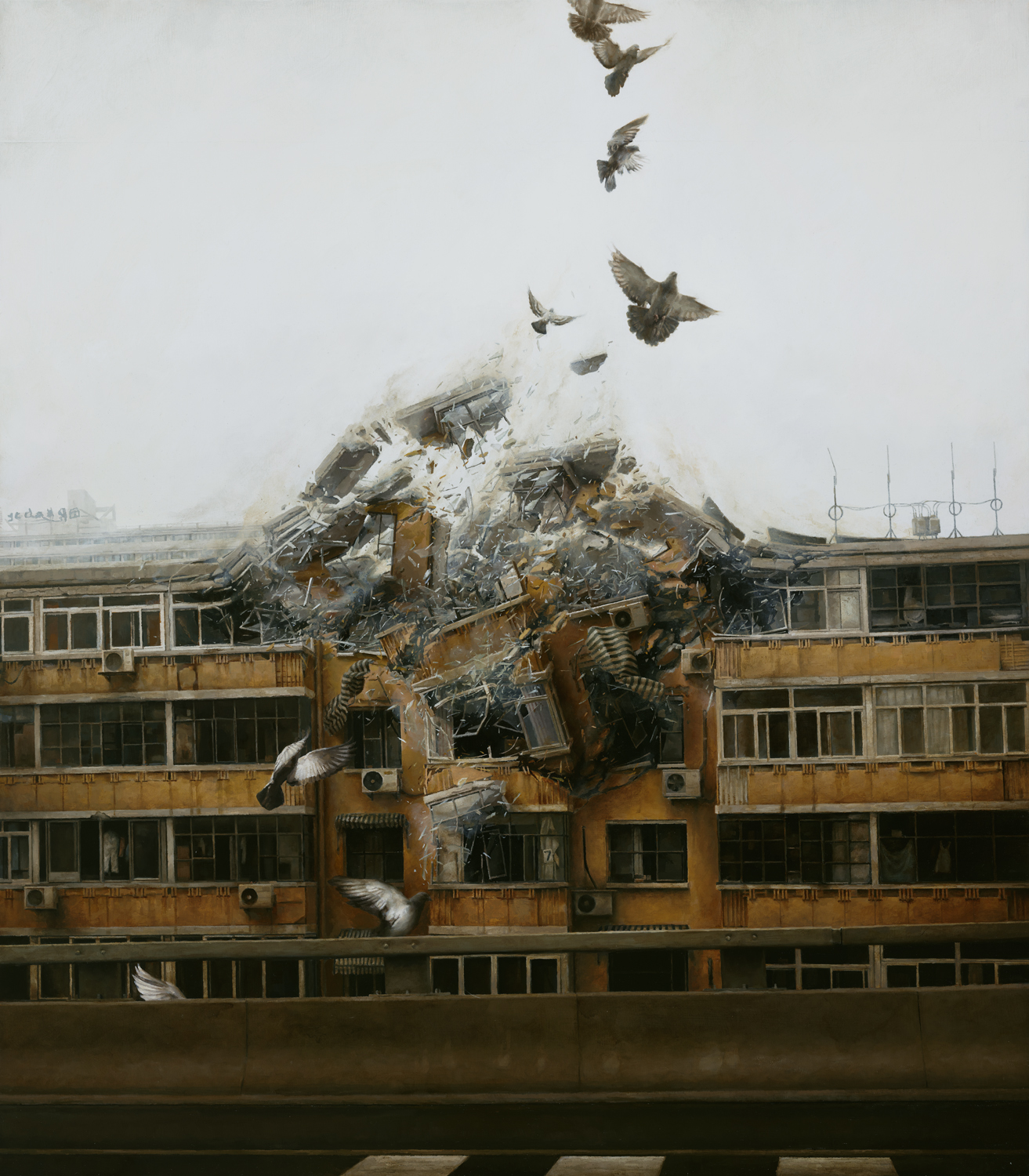
Jeremy Geddes was born in Wellington, New Zealand in 1974 and graduated from the Victorian College of the Arts in 2003. He paints primarily photorealistic paintings, depicting surreal scenes of individualscosmonauts, spaceships, doves, peoplesuspended in a black limbo, or of ruptures of urban settings, often accompanied by doves.


Ascent, 2013. Oil on Board.
Geddes is slow to create, often spending several months to complete a single painting and only finishing 2 to 3 paintings a year. His process is laborious, dedicating himself to each painting, first creating many studies of composition and color, and finally painting onto board layers of grisaille, opaque color, and glaze, all to create a photorealistic subtlety, as in Ascent. In Ascent, an astronaut appears to struggle against an overgrowth of flora in his helmet—this painting is thematically similar to many of his other works, depicting lone individuals in darkness and pitch-black isolation, often in misery, grief, or frustration. Ascent also contains a common motif of Geddes—astronauts, or, as he might call them, cosmonauts.

Misérere 5, 2012. Oil on Board.
Misérere 5, named after the French word for misery (misère), presents a similar common motif in Geddes’ work—spacecraft. In Ascent and Misérere 5 Geddes shows one of his prevailing themes—loneliness, and hopelessness. Both images—cosmonaut and spacecraft—are often seen as symbols of exploration and bravery into the deep unknown. But while these images and the dark expanses they exist in tend to be associated with feelings of wonder and awe, Geddes uses these explorers to evoke a kind of existential terror and hopelessness.

Misérere 42012. Oil on Board.

Begin Again, 2011. Oil on Board.
Another one of Geddes’ common motifs is doves. Unlike in his cosmonaut- and spacecraft-themed works, Geddes uses doves as symbols of distress and failure (as with the dove of Misérere 4 and its contorted body and splayed wings) and as harbingers of mayhem and disarray (as with the destructive rupture of Begin Again). In the same vein as Ascent and Misérere 5, Doves typically symbolize purity and grace, yet Geddes’ doves are anything but.
Geddes uses all of his symbols to convey a sense of dissonance and disorder, especially in their contrast with their typical interpretations. He turns these symbols on their heads, keeping them from their backgrounds of hope and power and trapping them in all-enveloping voids, empty.
That is why I chose Geddes, I think. When I saw his works for the first time, I was speechless just looking at the image on the page. While I enjoy images evoking wonder and awe as much as anyone else, I found myself especially moved by Geddes’ uses of color and light (or lack thereof) to create a really compelling sense of damning dread and uncanny stillness. Not to mention, the amount of detail he puts into his work is just to die for. The minute, precarious shreds of glass and concrete in Begin Again are completely worth my admiration.
I also felt drawn to Geddes’ art because it seems out of reach of my own abilities, in a way. Not only do I not have anywhere close to the patience he commands, but I also intensely aspire to the intensity of emotion he can create even without a narrative or, often, without a background.
(Unfortunately, I couldn’t find any drawings by him—Geddes doesn’t create finished drawings and isn’t really the type to release preliminary drawings)


References

“Jeremy Geddes in Conversation with Ashley Wood.” Juxtapoz, Feb. 2012.

Tudor, Silke. “A Perfect Vacuum: The Paintings of Jeremy Geddes.” Hi-Fructose,  June 2017.


Works Cited

Geddes, Jeremy. Ascent, 2013.

Geddes, Jeremy. Begin Again, 2011.

Geddes, Jeremy. Misérere 4, 2012.

Geddes, Jeremy. Misérere 5, 2012.