Monday, October 2, 2017

Thomas Hart Benton - Brittany Kampfer

Thomas Hart Benton
Thomas Hart Benton was born in 1889 in Neosho, Missouri. His family's history of living in the Bible belt and of being politicians highly influenced his murals, through which he sought to support political republicanism. From an early age, he was expected to follow his family's footsteps. After his first job as a cartoonist for the local paper showed potential for Benton to become a great artist, he deviated from his family's path and decided to pursue a degree in the arts at the Institute of Chicago, studying under Frederick Oswald. Two years later, in 1909, he moved to Paris to study at the well-known Academie Julian, where he had the opportunity to meet many other famous artists such as Diego Rivera and Stanton Macdonald-Wright. When he settled in New York in 1913, he experimented with different styles of drawing. He found his artistic identity during World War I, where he joined the U.S. Navy. In his time as a Navy man, he realized he was most comfortable with and enjoyed drawing and painting realistic scenes and landscapes. After earning degrees at both the University of Missouri and Lincoln University at Jefferson City, Missouri, he began to be commissioned for painting murals. New York's New School of Social Research commissioned Benton to paint a suite of murals named "American Today." These murals now hang in the Metropolitan Museum of Art. 

City Activities with Subway, from America Today

Metropolitan Museum of Art with Benton's murals
Another famous Benton mural sparked some controversy i
n 1936. Benton finished A Social History of the State of Missouri, in which he incorporated the Ku Klux Klan into the mural. This mural was still viewed as an important and significant part of the state’s history, therefore, it was allowed to remain hanging. 
A Social History of the State of Missouri
 
Benton received a few awards and continued to make a lasting impression unto the art community until his death on January 19, 1975, at 85 years old. He was working on a mural for the Country Music Hall of Fame of Nashville, Tennessee. This work, entitled The Sources of Country Music, remains unfinished and unsigned. 
I decided to write my report on Thomas Benton because my friend is really into art. Benton is one of her favorite artists, and I would like to be able to talk with her about his works. I appreciate that Benton has many various sketches about daily life and animals. I enjoy the refreshing depictions of realistic drawing and paintings. I am not a huge fan of modern art or abstract art because I can never quite grasp the meaning of it, although that is the point of those types of art. 

Coffee Break


Jato
Indian Study


Citations:

Benton, T. H. (1968). Benton drawings a collection of drawings. Columbia: University of Missouri Press.

Thomas Hart Benton | American Modernism | Metropolitan Museum of Art. (n.d.). Retrieved October 1, 2017, from http://www.questroyalfineart.com/blog/2012/12/thomas-hart-benton-metropolitan-museum-of-art/

“Thomas Hart Benton Biography, Art, and Analysis of Works.” The Art Story, www.theartstory.org/artist-benton-thomas-hart.htm.

Cathy Daley, by Michaela Anderson

Cathy Daley, born 1955, is an Associate Professor at Ontario College of Art and Design, Ontario, Canada. She's published many times in artfairs and solo and group exhibitions, received many awards and has been featured in many collections.1 She utilizes black, oil-pastel silhouettes of abstracted women's bodies to explore her persisting fascination with the female form and identity. In her artist statement, she says her work draws from "cultural images inspired by ballerina tutus, the garb of fairy-tale princesses and Barbie doll couture"1
Untitled 1054, 2017
Oil Pastel on Vellum
43 × 79 in

"Untitled 1054," a piece in her solo show hosted by Newzones, Calgary in 2017, reflects this investigation into the female form; the use of black pastel on translucent vellum enables full expression of motion, bold, expressive lines, and high contrast, Daley's work "investigates childhood memories of what it means to be female in Western culture."1

Untitled 1050, 2017
Oil Pastel on Vellum
43 × 76 in
What drew me to these works was how simple it seemed in theory--high contrast, gray scale paintings with a common motif: women, and femininity. Yet as I looked further into these paintings, I saw what seemed to be ideas that were tied into every painting. Daley's work, like "Untitled 1050," another piece from her show in Newzones, Calgary, is full of an interesting tension. The figures seem to be bold and energetic, but shrouded by abstraction from the waist up. The common consistency of the legs between pieces may reflect Daley's perception of the cultural representation of the feminine and the body. 
Untitled 1063
Oil Pastel on Vellum
24 × 19 in
"Untitled 1063" is another piece from Daley's solo show. Roni Feinstein from Art in America has written that her work "reflect[s] a contemporary, post-feminist ambivalence toward fashion, critiquing the garment industry’s wrapped-and-bound feminine ideal and the notion of woman as spectacle." My first impression was that her work was striking in it's simplicity, but it's left me wondering about femininity as a whole. Her expression has me inspired, and I hope I can achieve her level of emotion in my own work.

References

Daley, Cathy. “About.” Cathy Daley, www.cathydaley.com/. Accessed 2 Oct. 2017.1

“Cathy Daley.” Cathy Daley, Artsy, www.artsy.net/artist/cathy-daley. Accessed 2 Oct. 2017.

“Cathy Daley.” Artnet, www.artnet.com/artists/cathy-daley/. Accessed 2 Oct. 2017.

Catherine Osborne. "Cathy Daley (exhibition)." Parachute: Contemporary Art Magazine, Oct.-Dec. 1996, pp. 69-70. General OneFile, go.galegroup.com.proxy.lib.duke.edu/ps/i.do?p=ITOF&sw=w&u=duke_perkins&v=2.1&it=r&id=GALE%7CA30079906&sid=summon&asid=c21c837e427c549a0f2b51699540eefd. Accessed 2 Oct. 2017.

Campbell, N. (1993). Cathy daley. Matriart, 3(3), 7-11. Retrieved from http://proxy.lib.duke.edu/login?url=https://search-proquest-com.proxy.lib.duke.edu/docview/1320569422?accountid=10598

Works cited

Daley, Cathy. "Untitled 1063"
https://www.artsy.net/artwork/cathy-daley-untitled-1063

Daley, Cathy. "Untitled 1050"
https://www.artsy.net/artwork/cathy-daley-untitled-1050

Daley, Cathy. "Untitled 1054"
https://www.artsy.net/artwork/cathy-daley-untitled-1054

Patrick Pye - Paulina Asturias

Patrick Terence Pye was born in Winchester, England on April 10, 1929. He is a sculpture, painter and stained glass artist. He was born to an English father, Peter, who wrote sail stories and an Irish mother, Dorothy, who was a professional pianist. His parents had an unhappy marriage. His mother thought she needed to save her son from the Pye family so she took him back to Ireland when he was about two and a half years old. 
His artistic family background encouraged him to starts his career in the arts when he was a teenager. Even though he lived during World War II he, as many of his time did, didn’t portray it as much in his works of art. His paintings portrayed more his religious, rebellious side. Patrick decided to convert to Catholicism, favoring his grandmother, instead of following his mother’s footsteps, who was an atheist. His conversion caused his relationship with his mother to grow apart. When she died in 1958, he was 29yrs old, he felt that he could be more open to his religion and did most of his artistic work in relation to his relationship with God. 

Jesus at Manchester, 1954, watercolour, 11" x 15" 

The Mexican Bag, 1999, oil on linen, 10.25" x 12"
The Annunciation, c.2004, oil on copper, 41.5" x 37.5"


He developed his style as he grew up; he met many artists that taught him new techniques. In this first image he uses a Romanesque style: he includes abstraction of the background, hierarchical perspective (making the main character larger than the rest), and an unnatural geometrical treatment of form mostly in clothing.
He later improved his color technique. The Post-Impressionists taught him to do shadow by using cool color with a warm color contrast. That technique created sort of a imaginative brightness, as it is shown in the second image. He started using varieties of the same color for his paintings. In most of his paintings, color plays a crucial role.
His paintings tell a story, as the rebellious man he is, he likes to  paint in a non-naturalistic way and he ignores the three-dimensional realism. He draws icons as modern instead of the traditional ways. He paints according to his believe of less is more. 

I chose to research Patrick Pye because has an interesting story and is still alive, he had a personal input in what was written in the book that tells his story. This contact the author had with him is not usual in biographies, they are usually written after the artist has passed. But, in this case most of his storyline comes from his perspective, it might not be completely accurate, but it allows us to see from his perspective how he developed to paint the way he does. There is not much information about him online but his life is well documented by Brian McAvera, the author of his book.   

Works Cited

McAvera, Brian. Patrick Pye, life and work: a counter-Cultural story. Dublin, Four Courts, 2012.

Sunday, October 1, 2017

Jeremy Geddes - Micheal Head

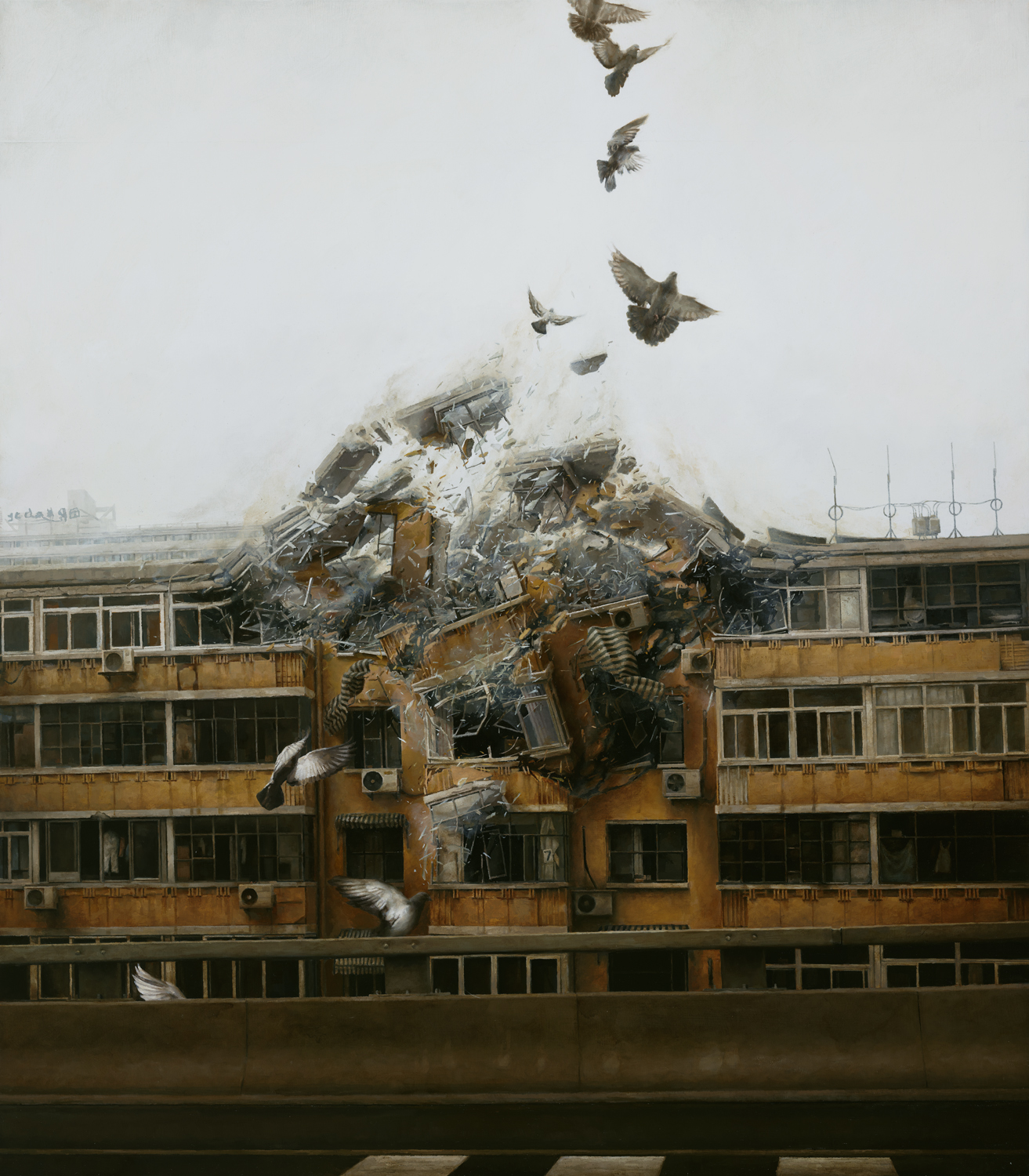
Jeremy Geddes was born in Wellington, New Zealand in 1974 and graduated from the Victorian College of the Arts in 2003. He paints primarily photorealistic paintings, depicting surreal scenes of individualscosmonauts, spaceships, doves, peoplesuspended in a black limbo, or of ruptures of urban settings, often accompanied by doves.


Ascent, 2013. Oil on Board.
Geddes is slow to create, often spending several months to complete a single painting and only finishing 2 to 3 paintings a year. His process is laborious, dedicating himself to each painting, first creating many studies of composition and color, and finally painting onto board layers of grisaille, opaque color, and glaze, all to create a photorealistic subtlety, as in Ascent. In Ascent, an astronaut appears to struggle against an overgrowth of flora in his helmet—this painting is thematically similar to many of his other works, depicting lone individuals in darkness and pitch-black isolation, often in misery, grief, or frustration. Ascent also contains a common motif of Geddes—astronauts, or, as he might call them, cosmonauts.

Misérere 5, 2012. Oil on Board.
Misérere 5, named after the French word for misery (misère), presents a similar common motif in Geddes’ work—spacecraft. In Ascent and Misérere 5 Geddes shows one of his prevailing themes—loneliness, and hopelessness. Both images—cosmonaut and spacecraft—are often seen as symbols of exploration and bravery into the deep unknown. But while these images and the dark expanses they exist in tend to be associated with feelings of wonder and awe, Geddes uses these explorers to evoke a kind of existential terror and hopelessness.

Misérere 42012. Oil on Board.

Begin Again, 2011. Oil on Board.
Another one of Geddes’ common motifs is doves. Unlike in his cosmonaut- and spacecraft-themed works, Geddes uses doves as symbols of distress and failure (as with the dove of Misérere 4 and its contorted body and splayed wings) and as harbingers of mayhem and disarray (as with the destructive rupture of Begin Again). In the same vein as Ascent and Misérere 5, Doves typically symbolize purity and grace, yet Geddes’ doves are anything but.
Geddes uses all of his symbols to convey a sense of dissonance and disorder, especially in their contrast with their typical interpretations. He turns these symbols on their heads, keeping them from their backgrounds of hope and power and trapping them in all-enveloping voids, empty.
That is why I chose Geddes, I think. When I saw his works for the first time, I was speechless just looking at the image on the page. While I enjoy images evoking wonder and awe as much as anyone else, I found myself especially moved by Geddes’ uses of color and light (or lack thereof) to create a really compelling sense of damning dread and uncanny stillness. Not to mention, the amount of detail he puts into his work is just to die for. The minute, precarious shreds of glass and concrete in Begin Again are completely worth my admiration.
I also felt drawn to Geddes’ art because it seems out of reach of my own abilities, in a way. Not only do I not have anywhere close to the patience he commands, but I also intensely aspire to the intensity of emotion he can create even without a narrative or, often, without a background.
(Unfortunately, I couldn’t find any drawings by him—Geddes doesn’t create finished drawings and isn’t really the type to release preliminary drawings)


References

“Jeremy Geddes in Conversation with Ashley Wood.” Juxtapoz, Feb. 2012.

Tudor, Silke. “A Perfect Vacuum: The Paintings of Jeremy Geddes.” Hi-Fructose,  June 2017.


Works Cited

Geddes, Jeremy. Ascent, 2013.

Geddes, Jeremy. Begin Again, 2011.

Geddes, Jeremy. Misérere 4, 2012.

Geddes, Jeremy. Misérere 5, 2012.

Peyton St. George- Andy Warhol

Andy Warhol by Peyton St. George

      Following the death of Andy Warhol (born August 6, 1928) at 6:32 a.m. on February 22, 1987 due to a sudden post-operative cardiac arrhythmia, his work became known everywhere. Warhol's use of different perceptions and how we view the world in his contemporary paintings, photography, video, and computer art have been related to the ideals of American consumerism. Some of his most known works include the Campbell's Soup Cans, Disasters, Brillo Boxes, Jackies, Marilyns, Flowers, Maos, Hammer and Sickles, Skulls, Rorschachs, and Self-Portraits. Each piece of art contains symbols easily recognized universally by society relating to the pop culture at the time. Warhol was a leader in the visual art movement known as pop art, which emerged in the late 1950's and created a new era of art not only through paintings/drawings, but through graphic design as well. I chose Andy Warhol as my artist due to his out of the ordinary pop art using contrasting colors and the complexity of his pieces using the simplest of objects. He is also known for doing the same piece dozens of time to compose of one final piece, this is due to his repetitive schedule day after day including going to mass each morning. His religious pieces were released a lot closer to his death.


Campbell's Soup Cans, 1962
The original Soup Cans exhibit was done as if the cans would be seen on the grocery store shelf, which is how Warhol became inspired to repeat them. Warhol then arranged them in chronological order from which each flavor was released starting with tomato in 1897. While this piece represents the mass production of the Campbell's advertisement, Warhol hand-painted each and every one, hand stamping the bottom edge of each can. He carefully reproduced an identical image across each can, his reasoning: "I used to drink it. I used to have the same lunch every day, for 20 years, I guess, the same thing over and over again."

Silver Car Crash (Double Disaster) 1963
This piece depicts a dead body mangled in the interior of a silver car immediately following an accident, printed by Warhol at age 35 as a part of the Death and Disaster series. This painting is seen as a "film erase", when the film ruptures during projection. Warhol was known as the "eye of the storm", being able to project his immense feelings into his works yet be completely unaffected by them. He remained calm in the midst of his times by using art to portray his emotions. This painting was sold for $105 million and has only been seen in public once over the last 26 years. 
Marilyn Diptych, 1962
Shortly after Marilyn's death on August 5th, 1962 Warhol began depicting her in the Marilyn Diptych. This piece is a silkscreen painting consisting of 50 images, all taken from the 1953 film Niagara. Warhol's reasoning for this piece was to capture the image of Marilyn's "beautiful face" especially following her recent death while using the simple method reproducing the same image with silkscreening. Half of this piece was heavily pigmented, with the other side in black and white. This portrays the stages between Marilyn's life and death, which is also related to the Christian work done by Warhol using the Virgin Mary on one side and the crucified Jesus on the other. This comparison "references the idolization of Marilyn Monroe..."


WORKS CITED

Warhol, Andy, and Ernst Beyeler. Andy Warhol: Series and Singles. Fondation Beyeler, 2000.

Andy Warhol. Institute of Contemporary Art, University of Pennsylvania, 1965.

“Andy Warhol's Marilyn Prints.” Color Vision &Amp; Art, WebExhibits, www.webexhibits.org/colorart/marilyns.html.

Reed, Alycia Faith. "Fifteen minutes and then some: an examination of Andy Warhol's extraordinary commercial success." MA (Master of Arts) thesis, University of Iowa, 2012. http://ir.uiowa.edu/etd/2973.

“Andy Warhol.” Wikipedia.com, en.wikipedia.org/wiki/Andy_Warhol.


James Rosenquist by Cameron Rosen

     James Rosenquist (November 29, 1933 - March 31, 2017) was one of the leading American Pop artist's from the 1960's. The Pop art movement involves the use of commercial art techniques to display popular images and everyday objects. Rosenquist began as a billboard painter, and utilised this experience as inspiration for his work. He used images from print advertisements, photographs, and popular newspapers and magazines to piece together his compositions. Rosenquist explored the mediums of painting, collage, drawing, and printmaking. His work has ignited questions about economics, romance, and ecology, as well as the cosmic and existential.
President Elect, 1960-61/1964. Oil on masonite. 
     Rosenquist worked on this painting on two different occasions. He began the painting in 1960, but then repainted the President Elect in 1964, after Kennedy's death. This is significant because this painting was done at two different points in history. Rosenquist's thought to repaint this piece after a major historical event shows his reliance of current events on his work. 

Marilyn Monroe, I, 1962. Oil and spray enamel on canvas. 
     This piece by Rosenquist was the painting that caught my eye while flipping through The Museum of Modern Art, New York book. I appreciated how even though he did not obviously depict Marilyn's face, I would be able to tell who it was based on her physical features, even without the text. The more mellow colors in this painting contrast to Rosenquist's other pieces that typically utilise bright and bold paints. This painting was in between paintings by Andy Warhol and Roy Lichtenstein, both of which used intense lines and contrasting colors; but I still was drawn to this painting opposed to any others. 

Star Thief, 1980. Oil on canvas.
     In this painting Rosenquist combined common objects, for example the pieces of bacon, the bolt, and the human face, with celestial and unearthly images. This takes Pop art to the next level by incorporating popular images from culture with the unknown of space. The intense color of this painting is an example of a more classic Rosenquist piece. 

     I chose to research James Rosenquist because I think my style of art is most similar to Pop art. I love using bright colors and am an interested in the idea of taking inspiration from what we experience around us and what is popular in our society at the moment. I think James Rosenquist combines an interesting level of reality and imagination that I admire. 

Works Cited

“BIOGRAPHY.” James Rosenquist, VAGA New York, www.jamesrosenquiststudio.com/biography.
     Accessed 29 Sept. 2017.

Lobel, Michael, and James Rosenquist. James Rosenquist: pop art, politics, and history in the 1960s.
     Berkeley, CA, University of California Press, 2010.

Rosenquist, James. “Marilyn Monroe, I.” MoMALearning, MoMA,
     www.moma.org/learn/moma_learning/james-rosenquist-marilyn-monroe-i-1962. Accessed 29
     Sept. 2017.

Rosenquist, James. “President Elect.” Guggenheim, The Solomon R. Guggenheim Foundation, 2017,
     www.guggenheim.org/arts-curriculum/topic/collage-and-scaling-up. Accessed 29 Sept. 2017.

Rosenquist, James. “Star Theif.” James Rosenquist, VAGA New York,
     www.jamesrosenquiststudio.com/selected-works/slideshow?view=slider#13. Accessed 29 Sept.
     2017.

The Museum of Modern Art, New York. New York, H.N. Abrams, 1986.

Paul Klee-Carolyn Bell

         Paul Klee, a printmaker and painter from Switzerland, was one of the many inspiring and renowned artists of the 20th century.  Klee was raised by a musician, which later was reflected in the melodic and rhythmic compositions of his painting and art.  Upon deciding to pursue art, he spent time at the Munich Academy studying both figure and landscape drawing.  After marrying a pianist, Klee worked in isolation for 5 years developing his skill and style.  With interest in Van Gogh, Klee began experimenting with the use of light and dark.  During this time he visited many impressionism exhibits in Munich.  

        Klee soon discovered a muse in Robert Delauney, who used a combination of color and abstract space.  This interest prompted a development of Klee's style, which came to include a balance between tonality and the dynamics of color.  This style, with his developed sense of using dark space as well as tonality of color can be seen in a painting he made during his time as a teacher at the Bauhaus. He painted the piece below by building up squares of color on a black background.

Static-Dynamic Gradation. 1923. Oil and gouache on paper
       As an instructor at the Staatliches Bauhaus, a Swedish art house, Klee both studied and produced the skills he taught.  The Static-Dynamic Gradation is a piece that came from his teaching of a color theory course.  During this time he also created the oil transfer drawing.  In this process he would trace drawings over top of a sheet of black oil to bleed through to a bottom sheet.  The result can be seen below in a print that shows a whimsy representation of the Bauhaus art school life.
Tale à la Hoffmann, 1921. Watercolor, pencil and transferred ink on printing paper
       
       Klee later left the Bauhaus to teach at the Düsseldorf art academy. In 1933, only two years after beginning at the academy, the Nazi party began to rise.  The school was taken over by Nazis and after being dismissed, Klee and his family left Germany.  The Nazi's eventually removed or destroyed 102 of his works from museums.  However, this did not dampen his spirt.  Klee continued to produce works until he died of a rare skin disease in 1940.  His art that still remains keeps his style alive.

       I chose Paul Klee because I was unsure who to choose and began exploring the Lilly Library art collection magazines and books.  When I stumbled upon Klee as a 20th century artist, I was immediately struck by how much I liked his use of color.  In pieces like Static-Dynamic Gradiation, color is the only subject yet the art remains interesting and engaging to look at and consider for a long time.  Clarification also had this effect on me, though the color scheme was lighter. This piece is interesting because again Klee uses varying techniques, like tiny dots of color layers over cubes of pastel colors, to pull his audience in.

Clarification1932. oil on canvas
       As a man who studied his art his whole life, Klee came to use lots of different materials.  He seemed to never get too comfortable in one medium, and all the pieces I chose were not completely encompassing of that.  Klee liked to layer different materials to produce different effects.  He used canvas, paper, oil, gauche, pencil, ink, watercolor, metal foil and more to create his masterpieces. Klee's father was a musician and he always tried to carry over the harmonies and rhythms into his work, as he did in Clarification.  Klee produces very beautiful and abstract art. As someone who has always struggled to produce abstract forms from my imagination, it is inspiring to see such a unique and beautiful abstract piece such as Klee's, and be able to appreciate what was in his mind's eye as he created his art.  These are some of my favorite abstract pieces, made towards the end of Paul Klee's career.
Angel Applicant, 1939. gouache, ink and pencil on paper
Disturbance, 1932. oil on canvas
References:

Ann Temkin. "Klee, Paul." Grove Art Online. Oxford Art Online. Oxford University Press. Web. 26 Sep. 2017.

"KLEE, Paul." Benezit Dictionary of Artists. Oxford Art Online. Oxford University Press. Web. 26 Sep. 2017. 


Paul Klee: Angel Applicant, gouache, ink and pencil on paper, h. 19-1/4, w. 13-3/8 inches (48.9 x 34 cm.), 1939 (New York, Metropolitan Museum of Art, The Berggruen Klee Collection, 1984, Accession ID: 1984.315.60); © 2007 Artists Rights Society (ARS), New York/VG Bild-Kunst, Bonn, photo © The Metropolitan Museum of Art

"Paul Klee: Static-Dynamic Gradation, oil and gouache on paper, bordered with gouache, watercolor, and ink, h. 15, w. 10-1/4 inches (38.1 x 26.1 cm.), 1923 (New York, Metropolitan Museum of Art, The Berggruen Klee Collection, 1987, Accession ID: 1987.455.12); © 2007 Artists Rights Society (ARS), New York/VG Bild-Kunst, Bonn, photo © The Metropolitan Museum of Art." Grove Art Online. Oxford Art Online. Oxford University Press. Web. 26 Sep. 2017. 


Paul Klee: Tale à la Hoffmann, watercolour, pencil and transferred printing ink on paper, bordered with metallic foil, h. 12-1/4, w. 9-1/2 inches (31.1 x 24.1 cm.), 1921 (New York, Metropolitan Museum of Art, The Berggruen Klee Collection, 1984, Accession ID: 1984.315.26); © 2007 Artists Rights Society (ARS), New York/VG Bild-Kunst, Bonn, photo © The Metropolitan Museum of Art


Paul Klee: Clarification, oil on canvas, h. 27-3/4, w. 37-7/8 inches (70.5 x 96.2 cm.), 1932 (New York, Metropolitan Museum of Art, The Berggruen Klee Collection, 1984, Accession ID: 1984.315.54); © 2007 Artists Rights Society (ARS), New York/VG Bild-Kunst, Bonn, photo © The Metropolitan Museum of Art


Paul Klee: Disturbance, oil on canvas, 1934 (Turin, Galleria d’ Moderna); © 2007 Artists Rights Society (ARS), New York/VG Bild-Kunst, Bonn, photo credit: Alinari/Art Resource, NY