Until this semester, I hadn't really drawn much on paper for years. But I HAD dabbled a lot in graphic art, and I propose that there's a lot more similar about drawing and graphic design than there is different. Three years ago, when I was a freshman, I stumbled into the realm of graphic design and loved it. Most of what I know I've taught myself using online tutorials. I've read about and played around a lot with photo-editing, logo-design, publicity, t-shirt design, and typography - they are some of the most useful and enjoyable skills I've ever learned.
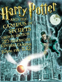
This weekend, I had to make a flyer for an event my living group is holding. It's a Harry Potter themed party (since the new movie is about to come out). It's actually one of the more complicated flyers I've done, so I thought I'd break it down and try to relate it to some of the concepts we've been discussing in class. Everything is done in Photoshop, and I start with the Duke Chapel. I love using (and distorting) this element because it is soooooo iconic for Duke. (I can't say that I've tackled drawing the chapel - it's on my to-do list...) This one was conducive to my overall composition needs because it had a good amount of negative space on the left side for the text.
 The next step was to create a stormy looking background, in accordance with every Harry Potter promotion ever made. I created some dark layers with clouds, then drew in some lightning streaks. I think this would be really hard to do in a drawing - the subtractive method would probably work for the clouds, but the lightning has to be really white, so you'd probably have to know where you wanted them an not shade that area.
 In the next few layers, I colorized the image and added a glow effect to the chapel. Then I added HP himself on a broomstick chasing a snitch. This required some thought about perspective - in order to create the sense of the snitch coming at you, it had to be sized very large in the foreground. HP was placed in the midground. The layout here is actually pretty critical - you have to consider both 3D perspective and how the elements fill the 2D space of the flyer.
 Finally, the text was added. It was made to appear 3D, basically by creating a shadow (like additive drawing) and a highlight (like subtractive drawing). The finishing touch was two lens flares, which show up as highlights on the "P" and the snitch.
Hey Lauren! This is absolutely beautiful! It looks really professional, and the chapel is a perfect backdrop for the theme/subject matter! Which of Bill's drawing section are you in?
ReplyDeleteOnce again, great job!